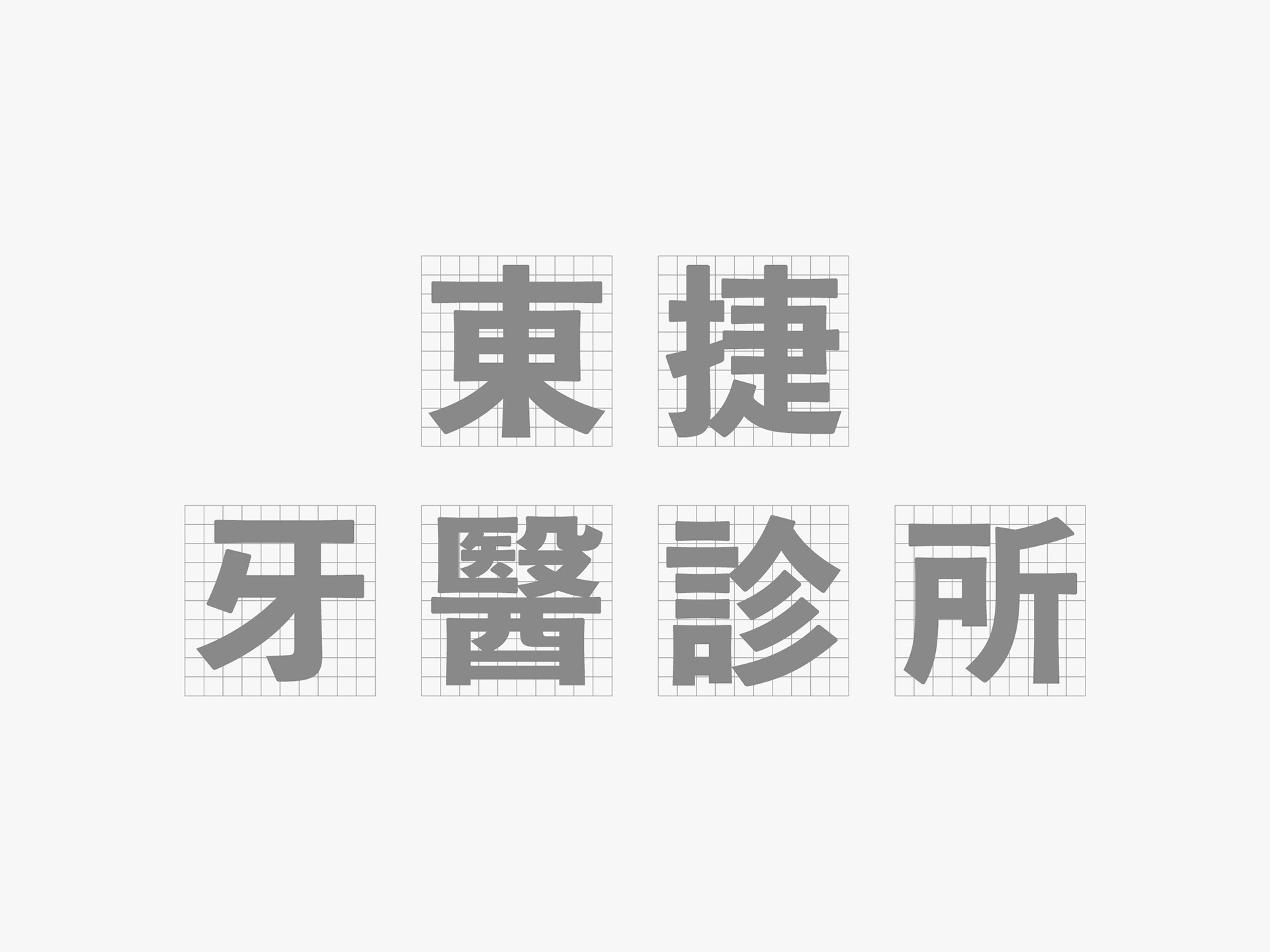
東捷牙醫診所 - 視覺識別
Dong-Jei Dental Clinic - Visual Identity
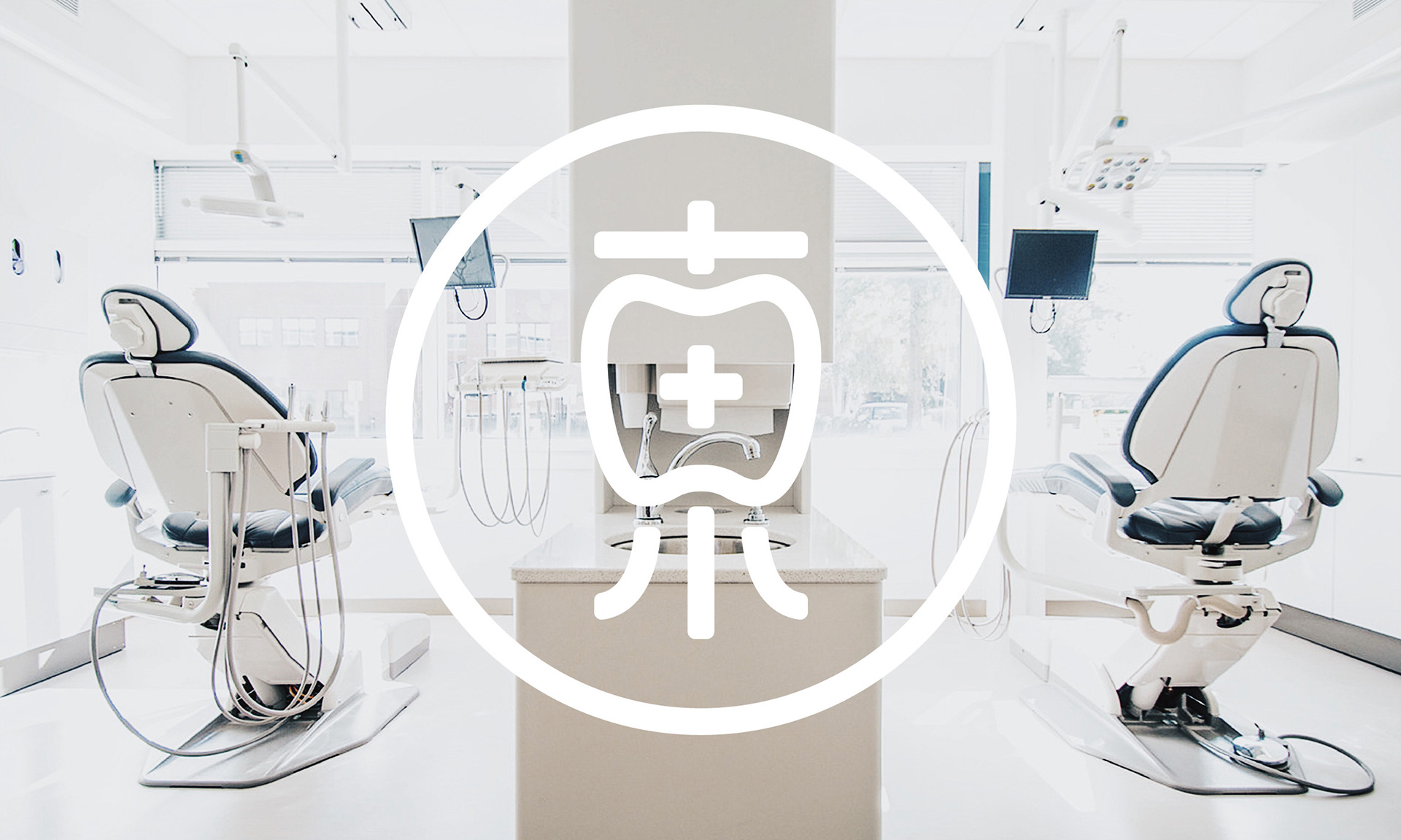
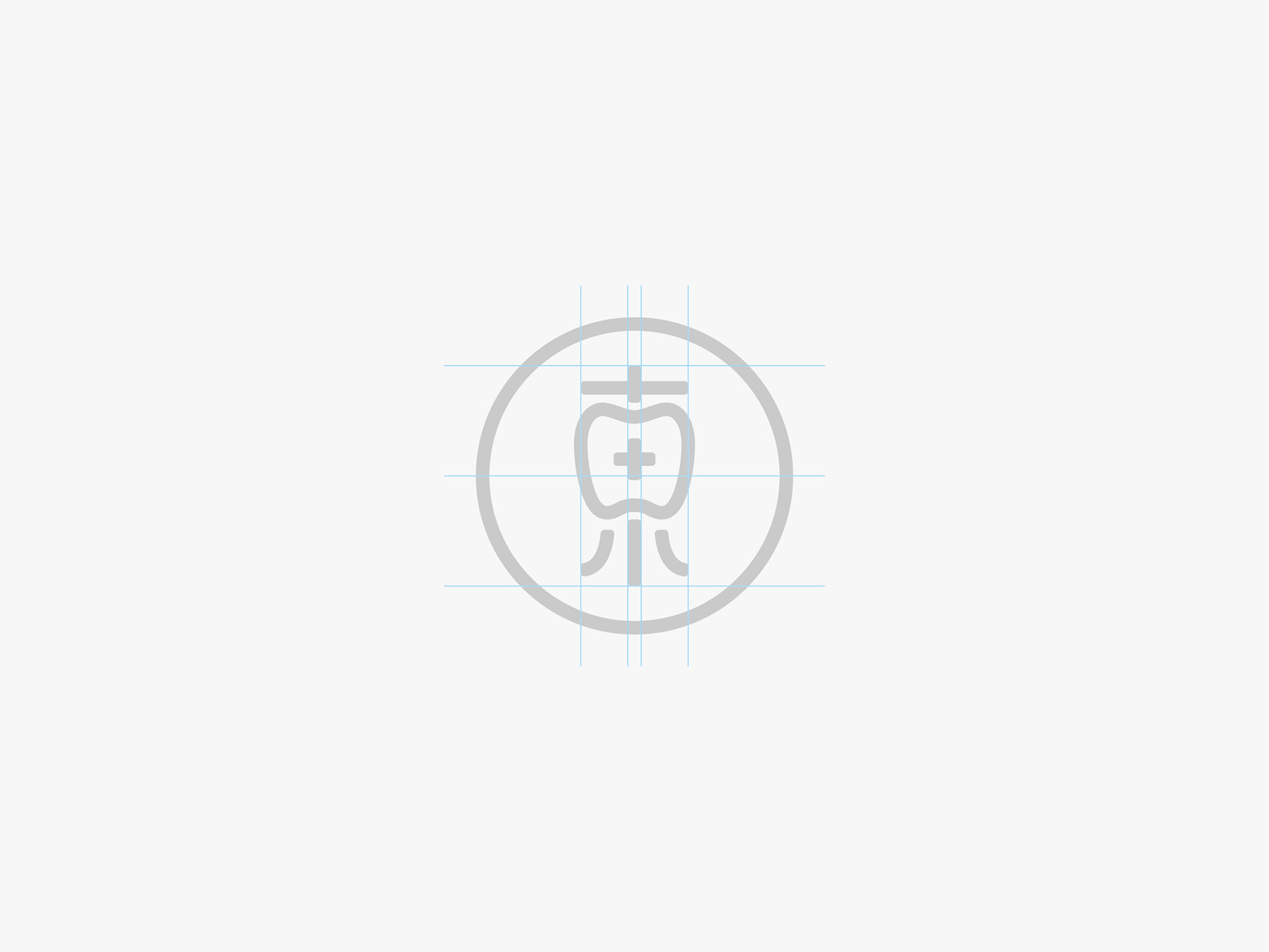
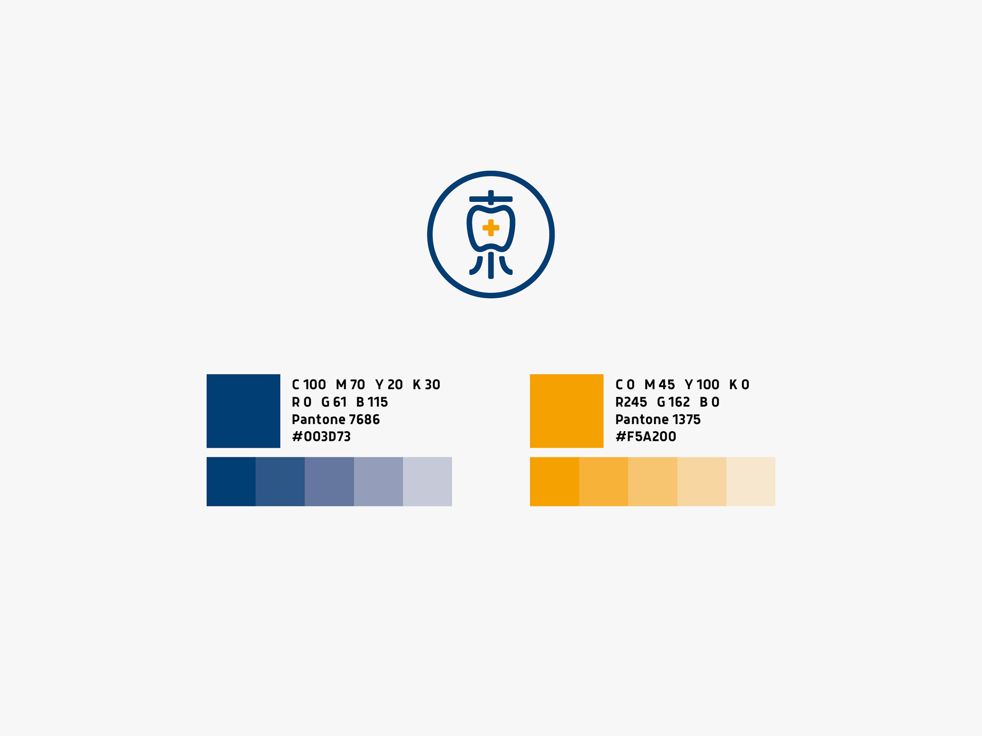
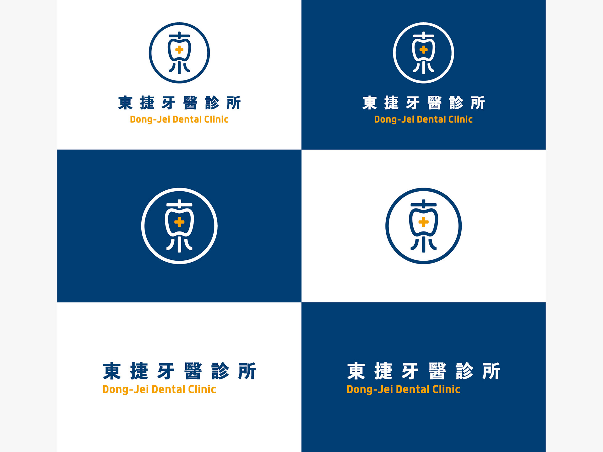
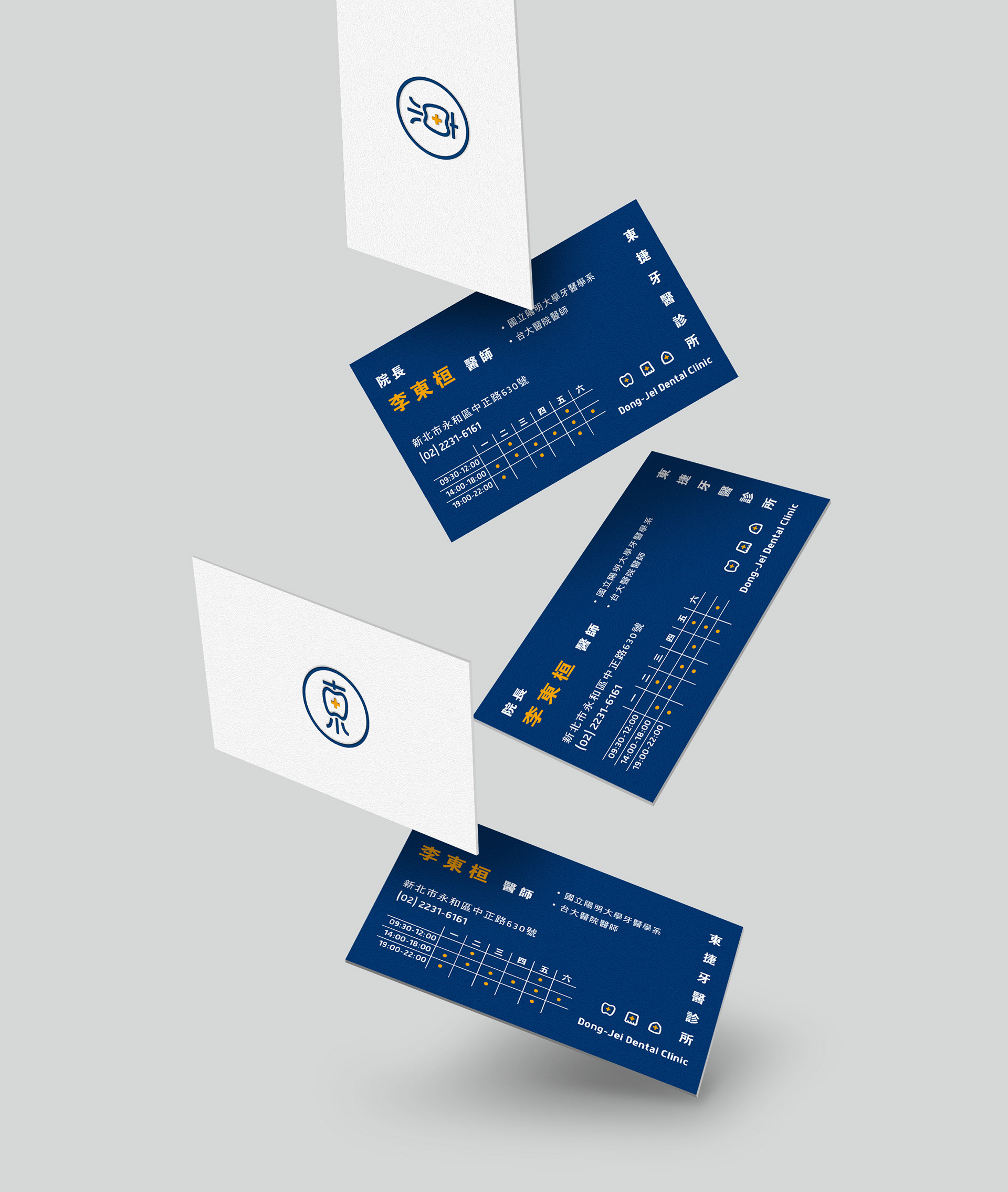
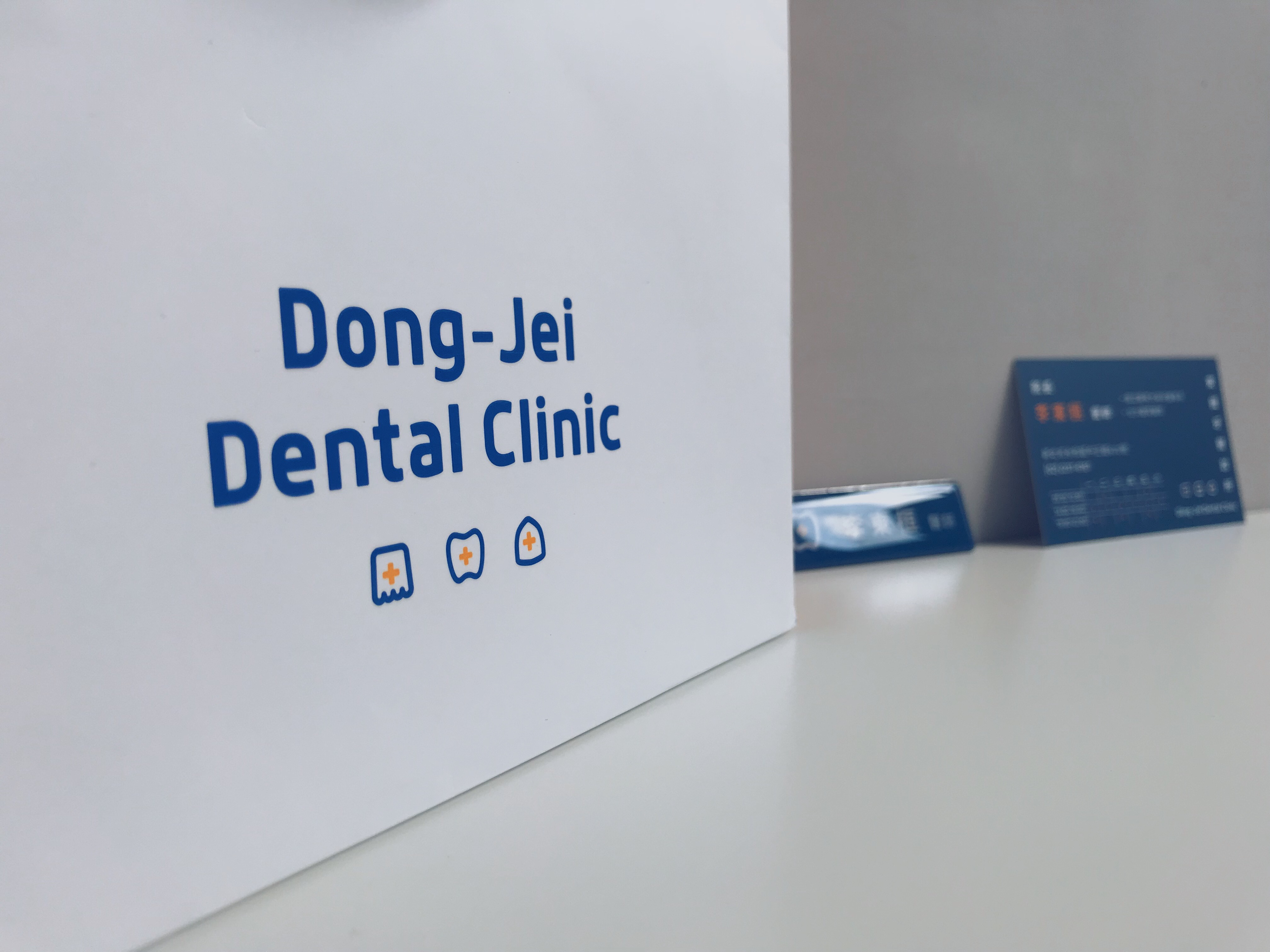
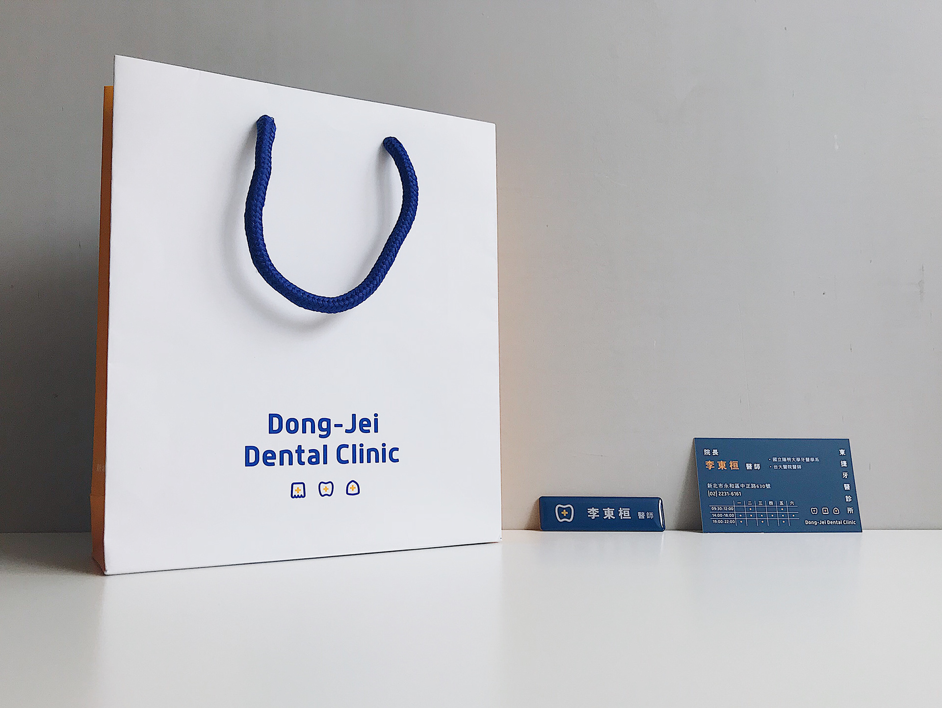
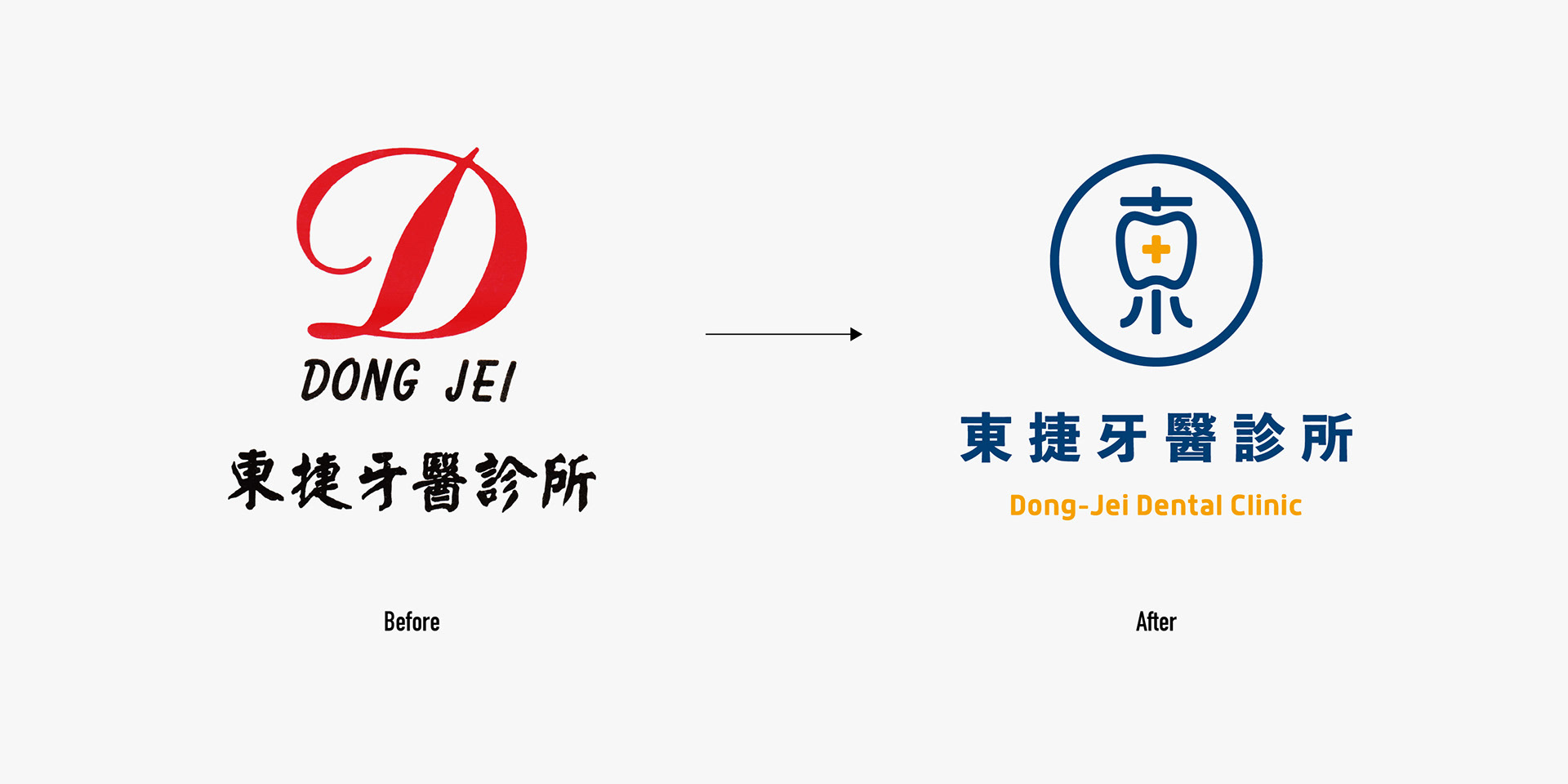
整個logo以名字東捷的“東”字為主要概念,框框的臼齒造型呼應了主業牙醫,而中間十字則是象徵醫療之意。
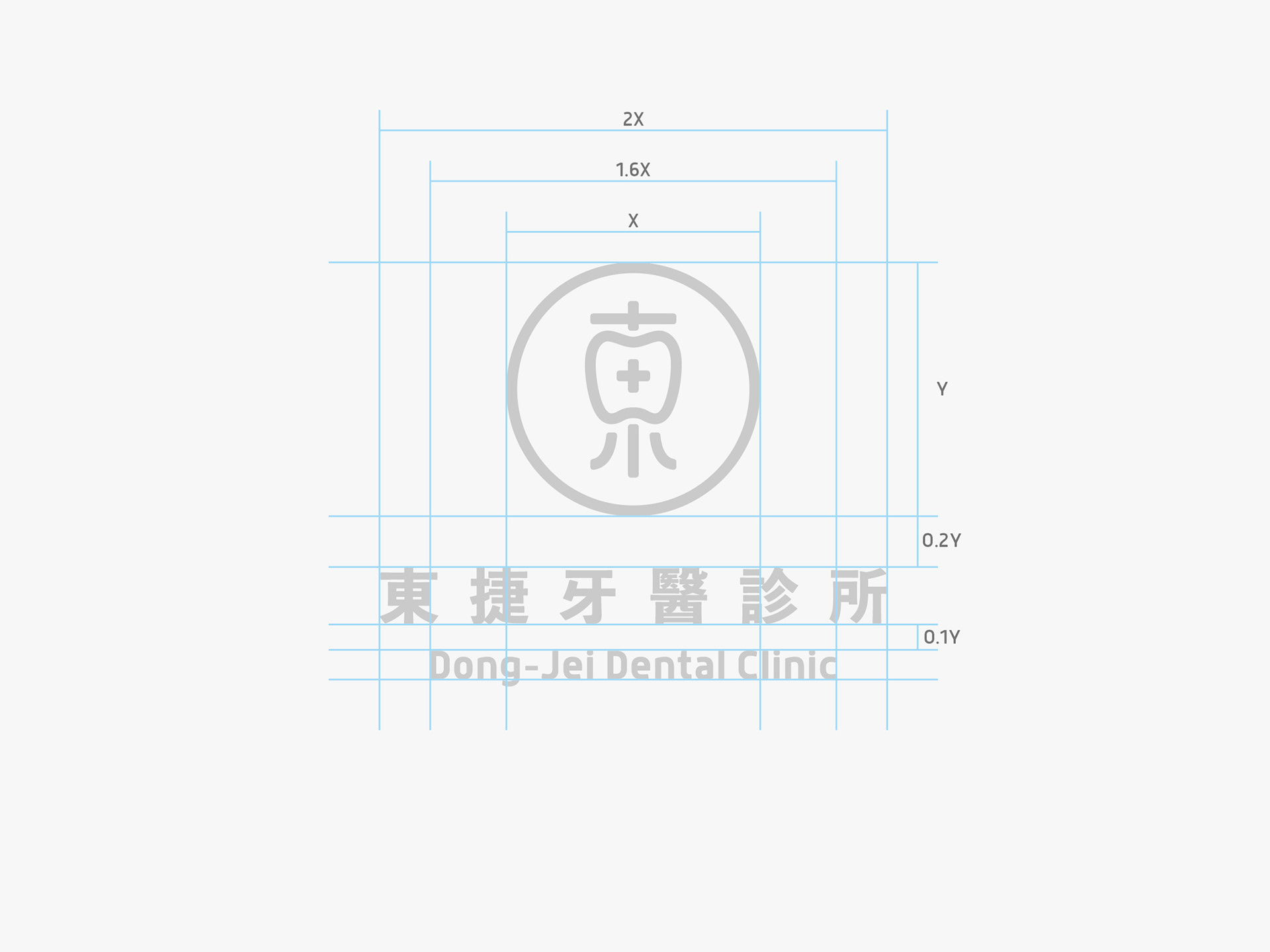
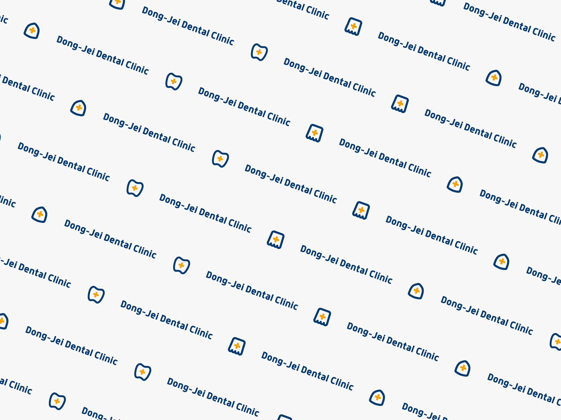
主要顏色上使用藍橘白三種做搭配,給人較和藹親近的感覺,讓形象有新活力又不失專業。
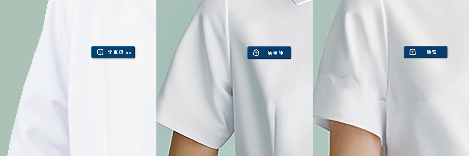
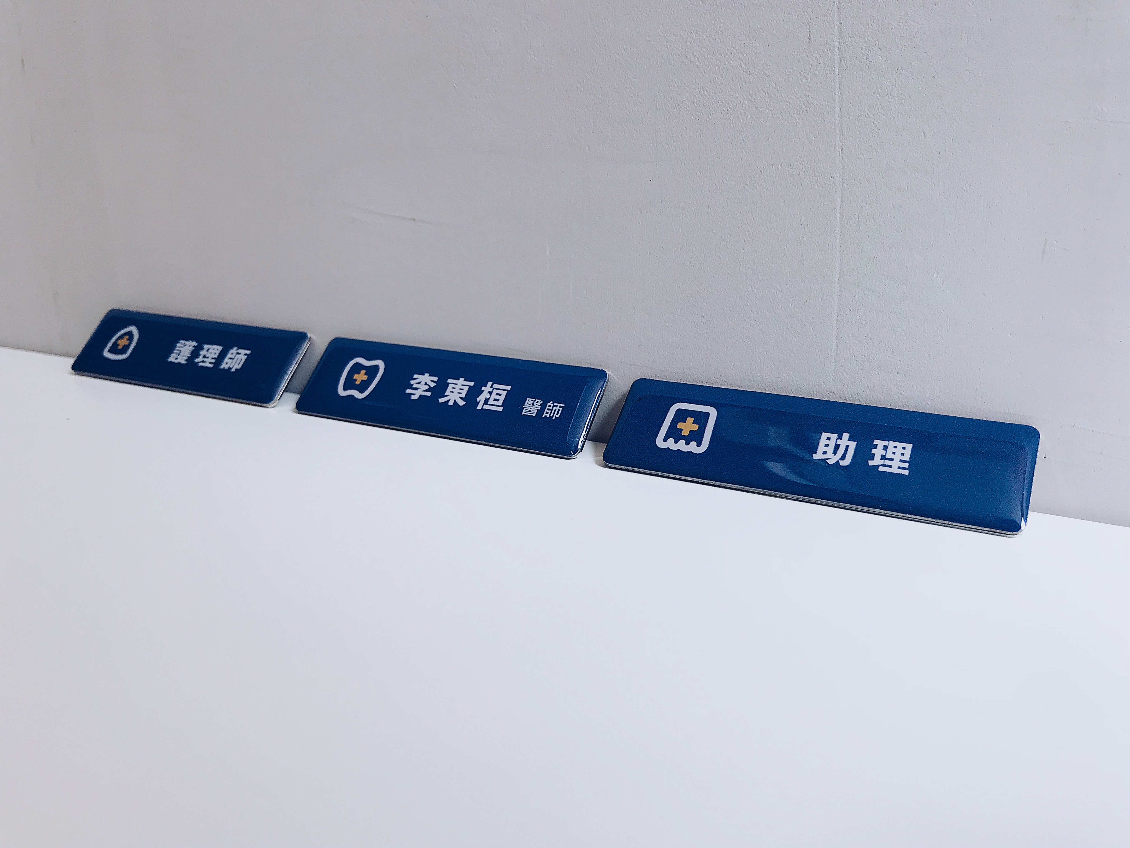
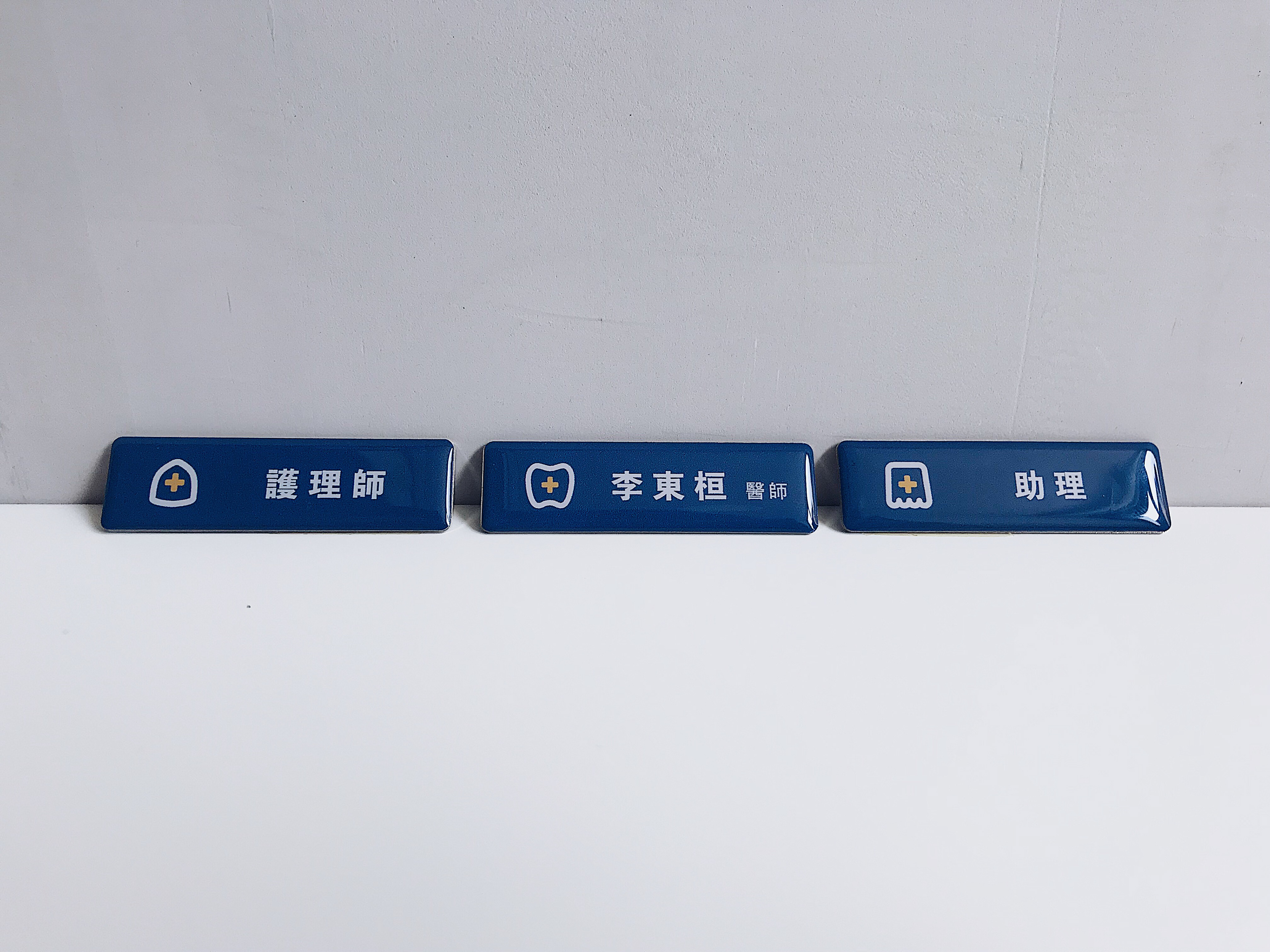
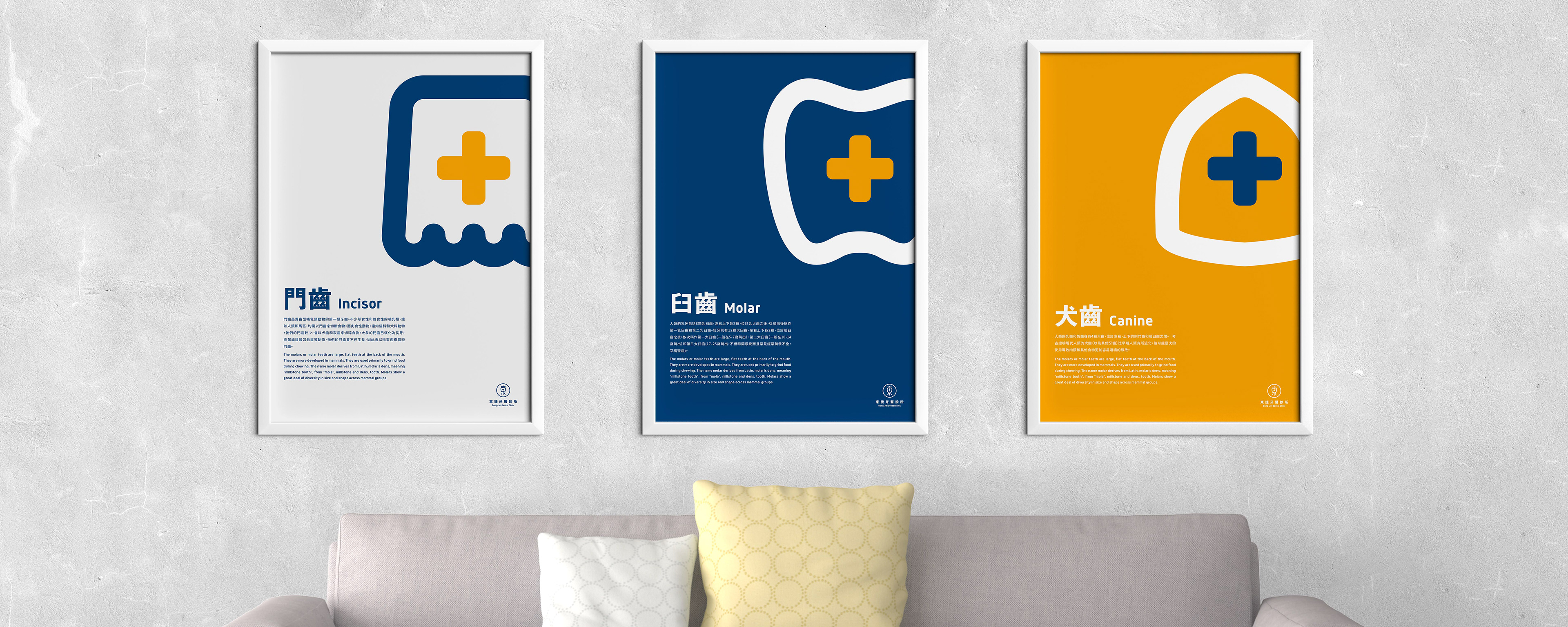
延伸應用的設計上,將牙齒的主要三個部分,門齒、犬齒、臼齒,分別呼應到診所內助理、護理師、醫師三個職位。
門齒,展現笑容第一眼看到的門面,對應坐在櫃檯的助理,親切地接待每一位顧客。
犬齒,主要用於穿刺、撕裂食物,就像護理師總是給予醫師最有力的協助。
臼齒,在食用上扮演研磨和咀嚼食物的最大工程,如同醫師在整間診所扮演最核心的角色。
用可愛的方式呈現三種牙齒,降低大眾對看牙醫的畏懼,同時也多了點親近感。
The concept of lettermark is based on “東”, the first Chinese character of the name of the dental clinic “東捷”. The rectangle of “東” is redesigned into the shape of molars, symbolizing the focus on dental professionals. The cross inside the rectangle is an emblem of healthcare industries.
The logo is mainly comprised of three colors: blue, orange and white. The colors are meant to present friendliness and hospitality. The core value is to provide both energetic and professional impression on customers.The following will explain the extended application of this design. Based on the functions, three main types of teeth (incisors, canines, molars) respectively show association with three main characters in a dental clinic (receptionists, dental assistants, dentists).
Incisors, the most prominent teeth visible when a person smiles, can be associated with the role of receptionists who play an important part in establishing a clinic’s image.Canines, having the function of gripping and tearing food, can be associated with the role of dental assistants who always provide dentists with supportive assistance. Molars, the main character for food intake, are in charge of chewing, crushing and grinding food. Likewise, dentists play a crucial part in a dental clinic.
These three types of teeth mentioned above are presented in an amiable way not only to ease customers’ nervousness for going to the dentist but also to make the impression of dental industries more approachable to the public.


東捷牙醫診所 - 視覺識別
Dong-Jei Dental Clinic - Visual Identity
-----
Client | 東捷牙醫診所 Dong-Jei Dental Clinic
Design Agency | THE 90s LAB
Designer | Tan Yu-Chen
延伸閱讀:完整提案過程紀錄與槍搞