凌宇化工 MODERN LAB - 視覺識別 Visual Identity
凌宇化工成立於西元1972年,迄今四十餘年的漫長歷程,專精於美髮系列產品之研發生產及銷售,以供應各式型態專業美髮沙龍市場為主,『洗、護、燙、染、造型』各式產品樣樣俱全,在美髮業界頗享薄譽與肯定。
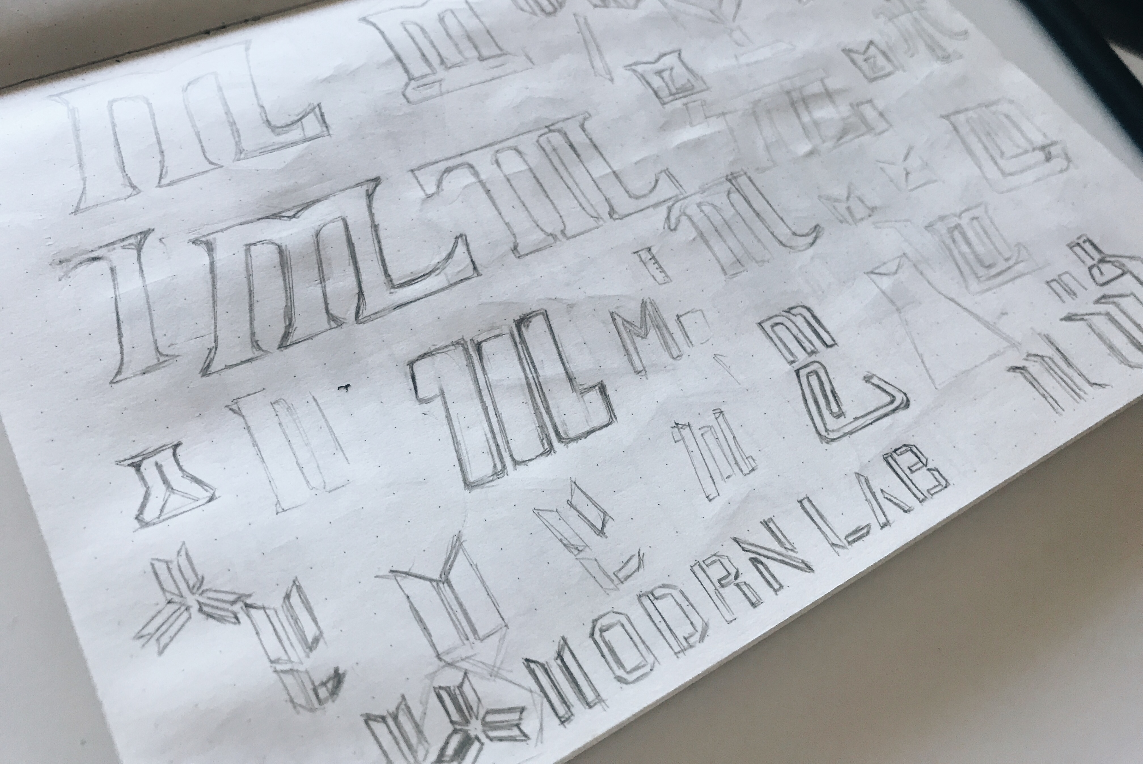
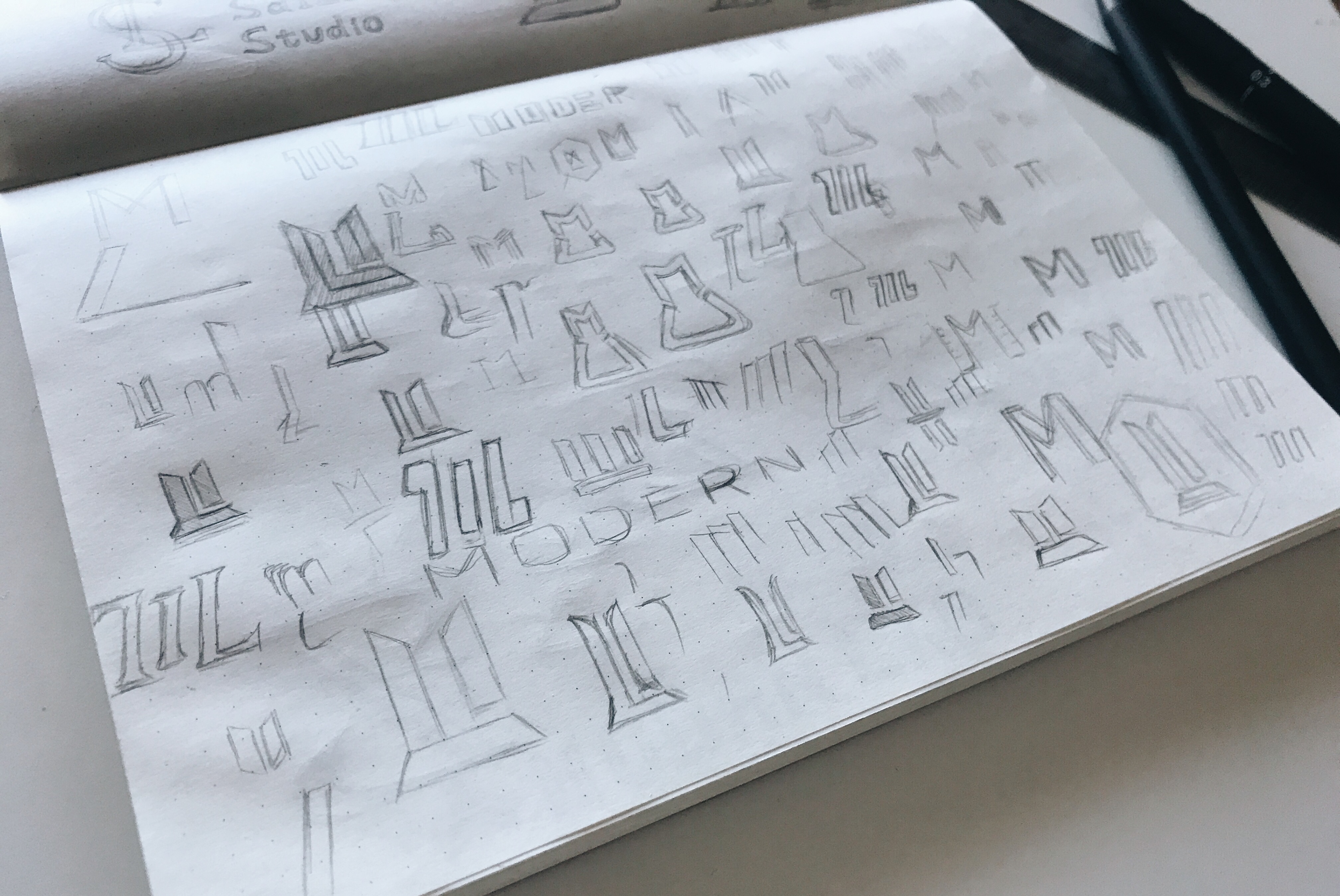
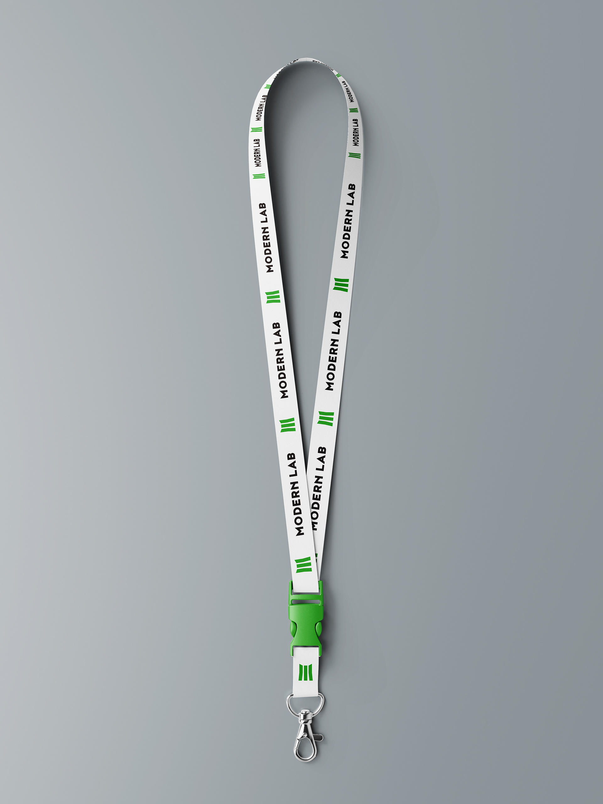
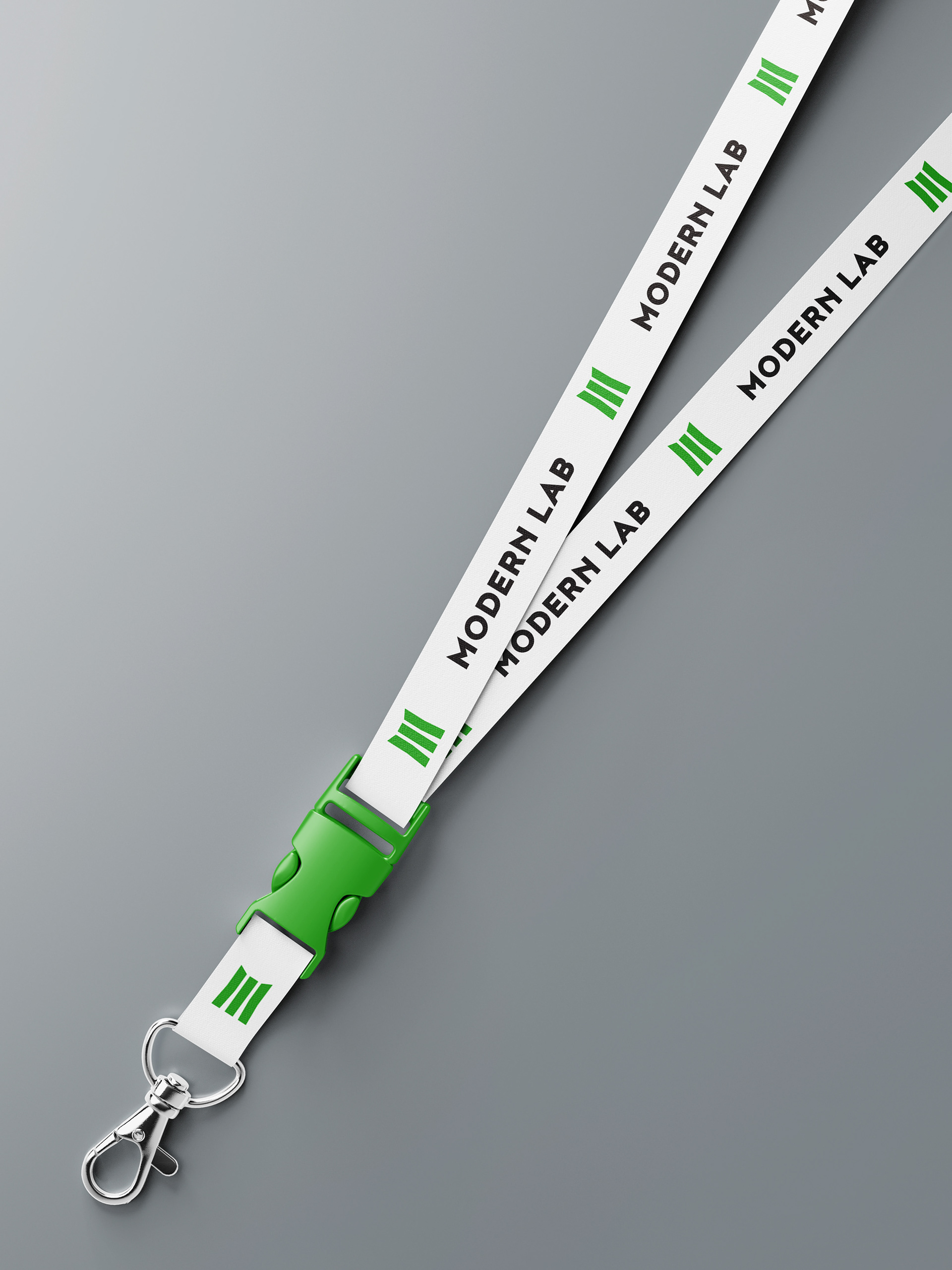
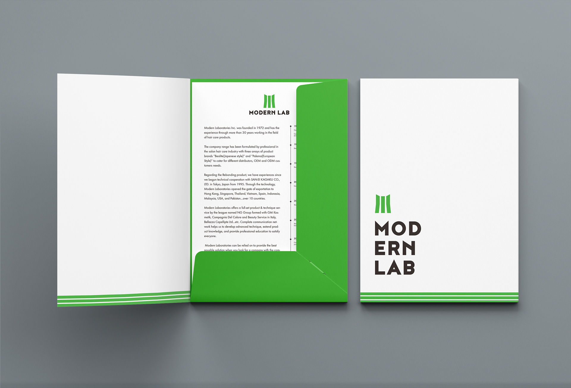
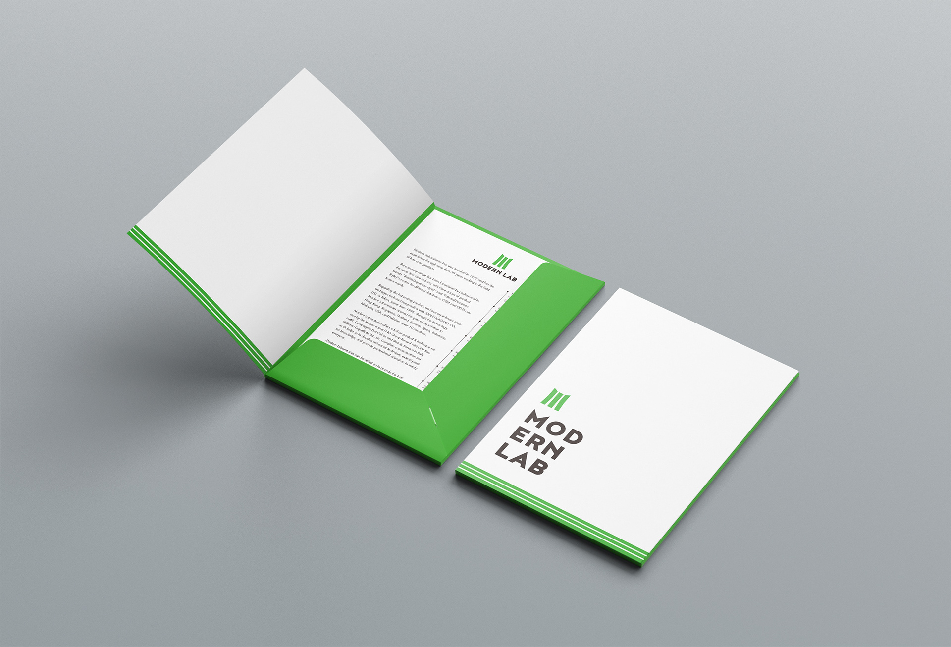
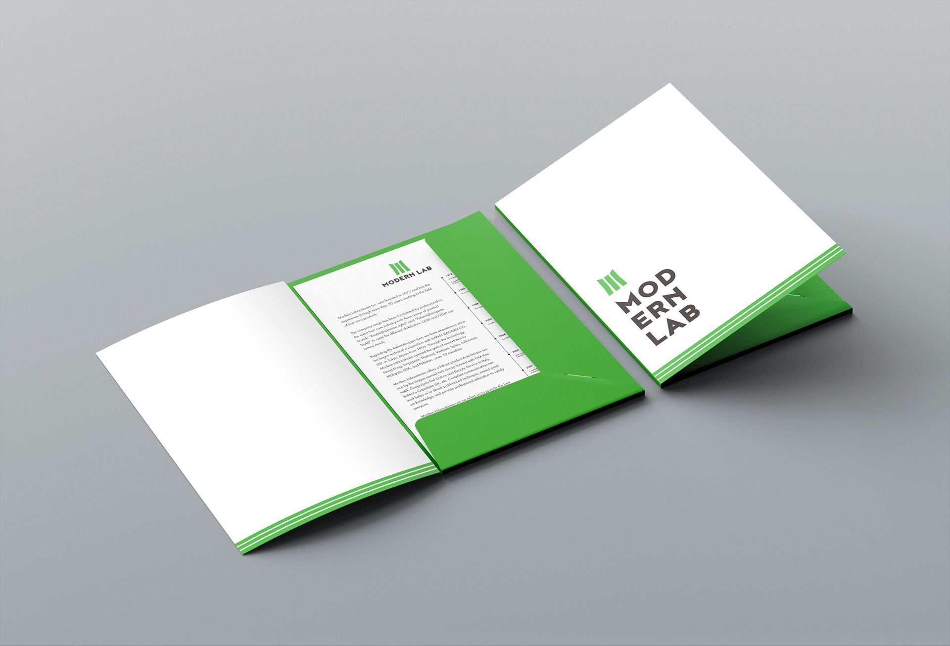
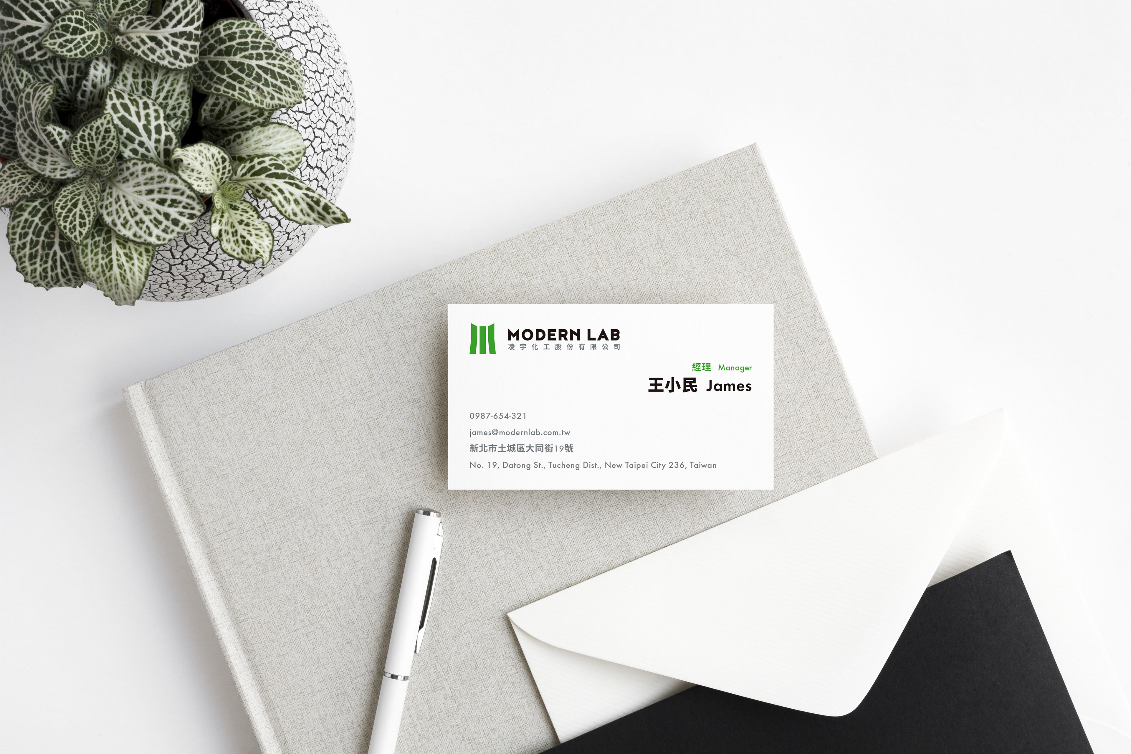
在標誌的設計上以英文開頭“M”為主要元素,融合量杯、試管等造型做修飾,象徵化學相關主業。英文標準字配合標誌,較為尖銳、有力量。顏色選用明亮的綠色為主色搭配黑色與灰色,整體設計風格簡約、專業,呈現凌宇化工清新、有活力的新形象。
Modern Lab, established in 1972, has a long history of more than 40 years. The company specializes in the research and development, production and sales of hair salon products, and mainly supply to various types of professional hair salon. It provides "washing, care, perm, dyeing, styling" all kinds of products, and won a good reputation and recognition in the hair salon industry.
Regarding this logo design, letter “M” as main element combines with the shape of measuring cup and test tube to symbolize chemical industry. English logotype with mark conveys the ideas of sharp and powerful. Bright green is chosen for the main color along with black and gray. The overall style is simple but professional, presenting a new image of Modern Lab: fresh and energetic.
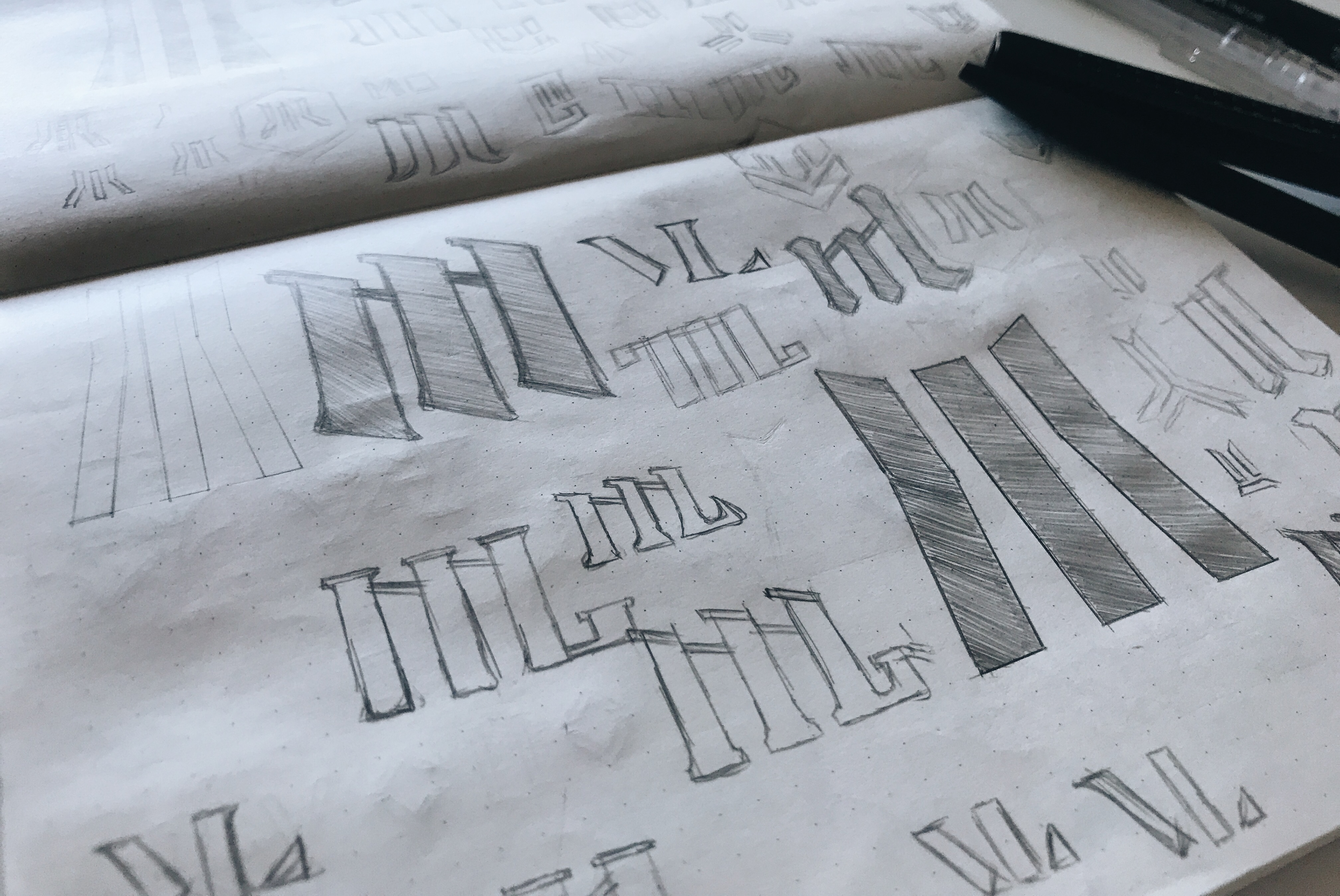
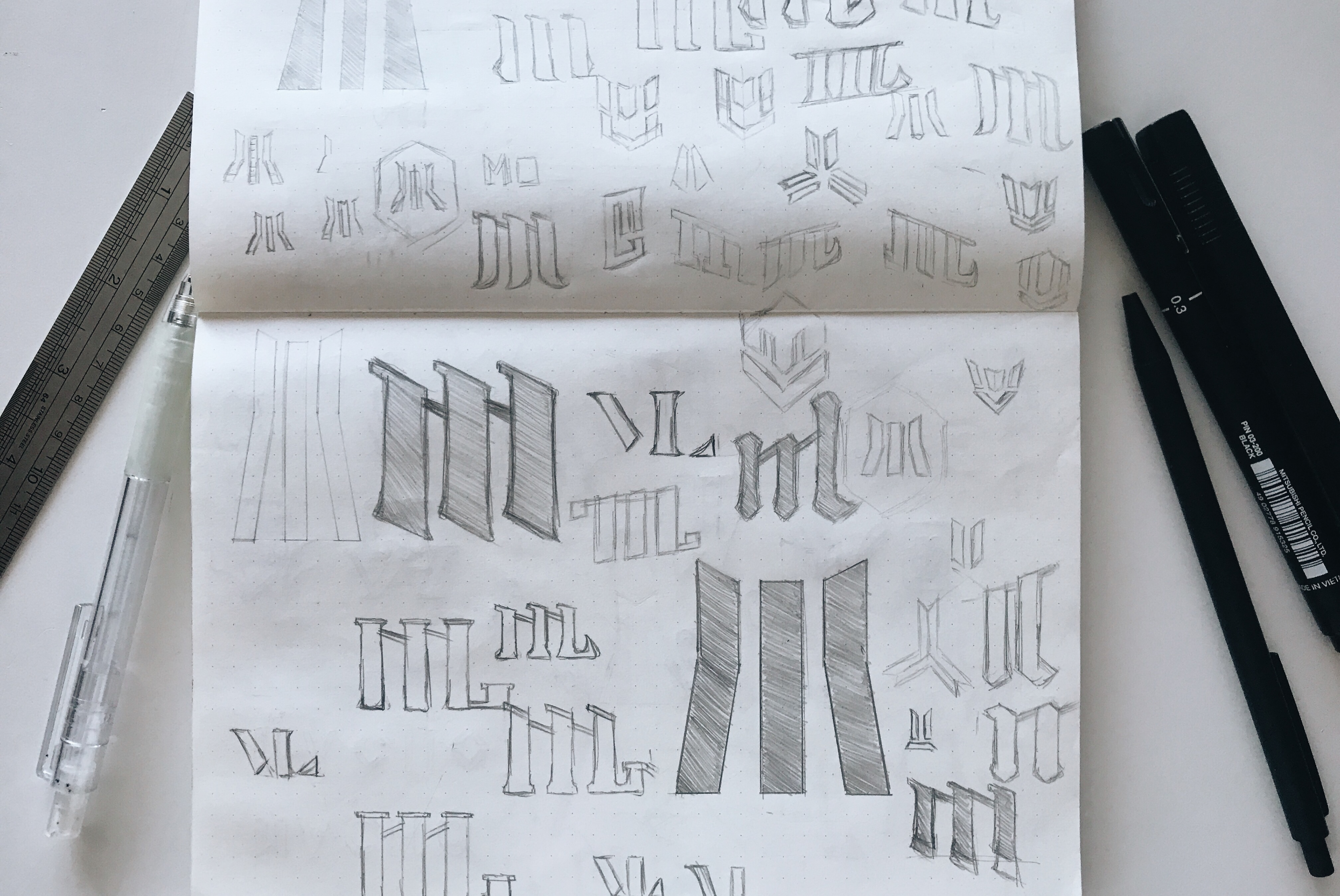
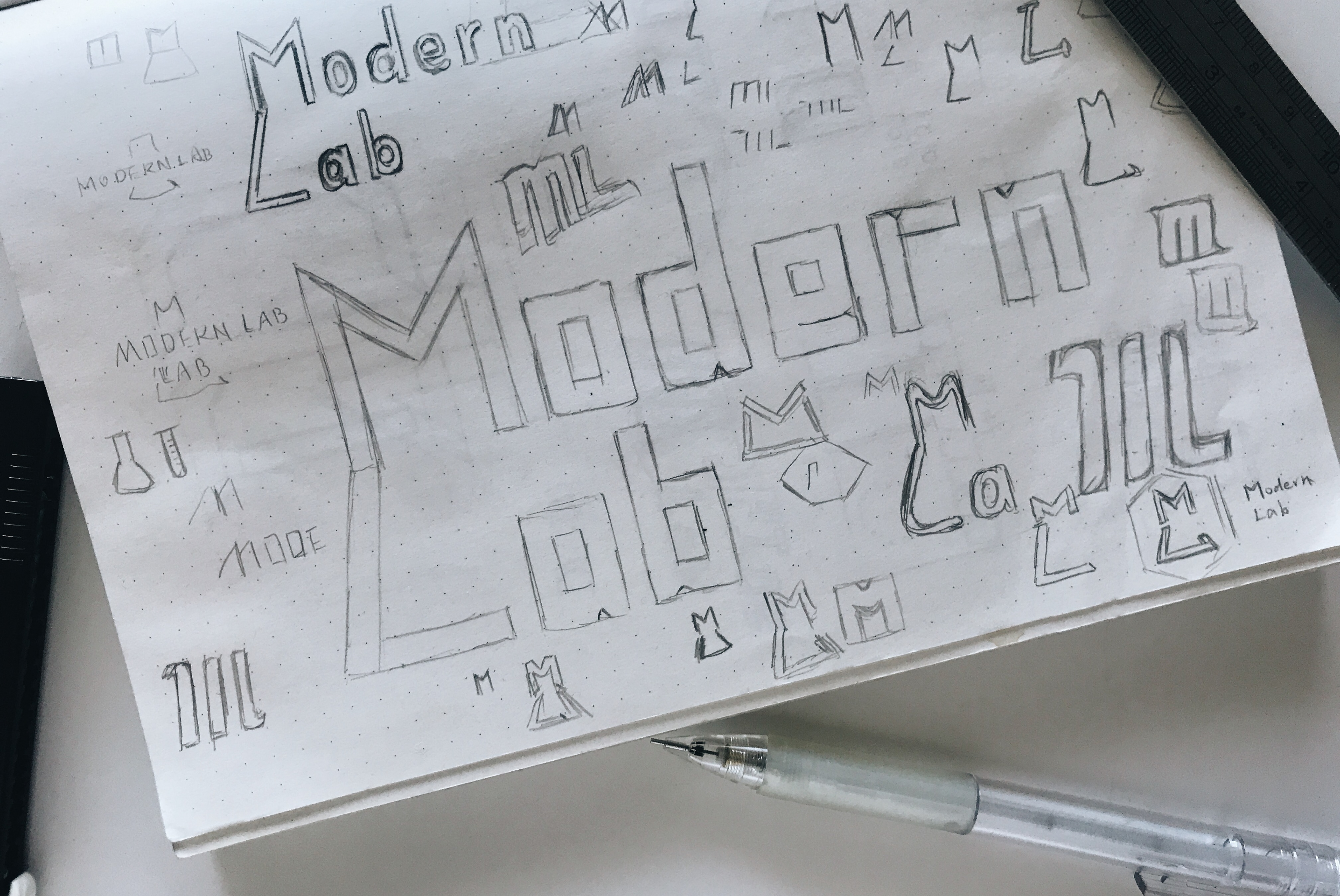
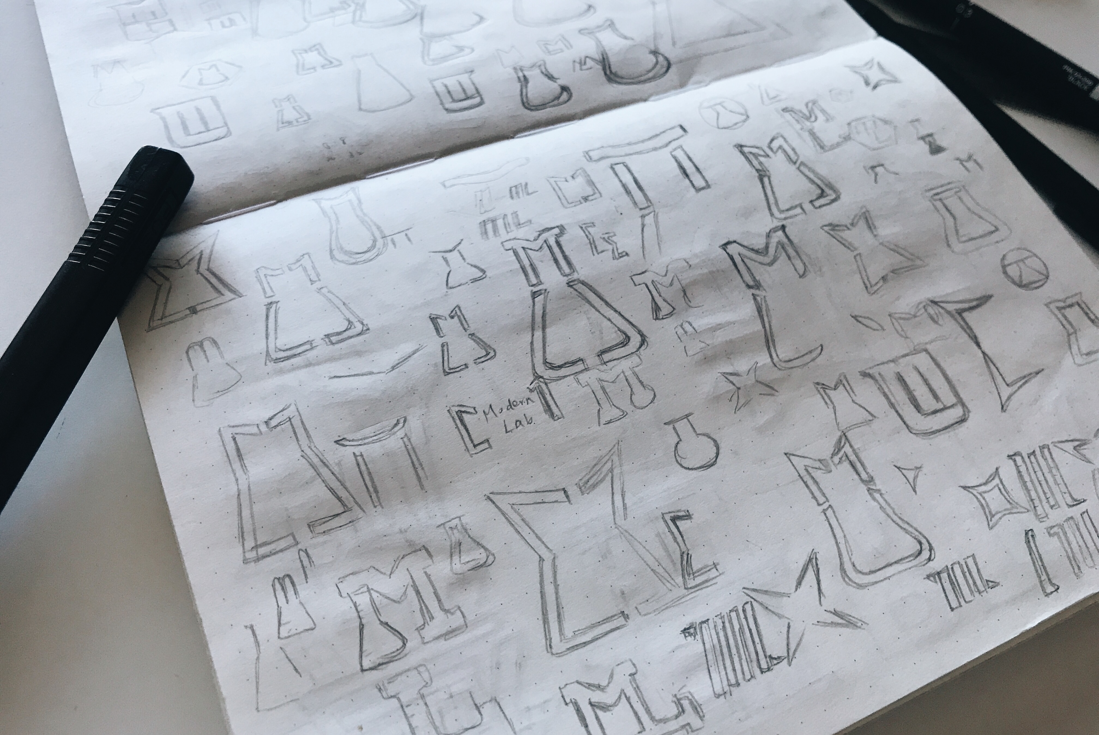
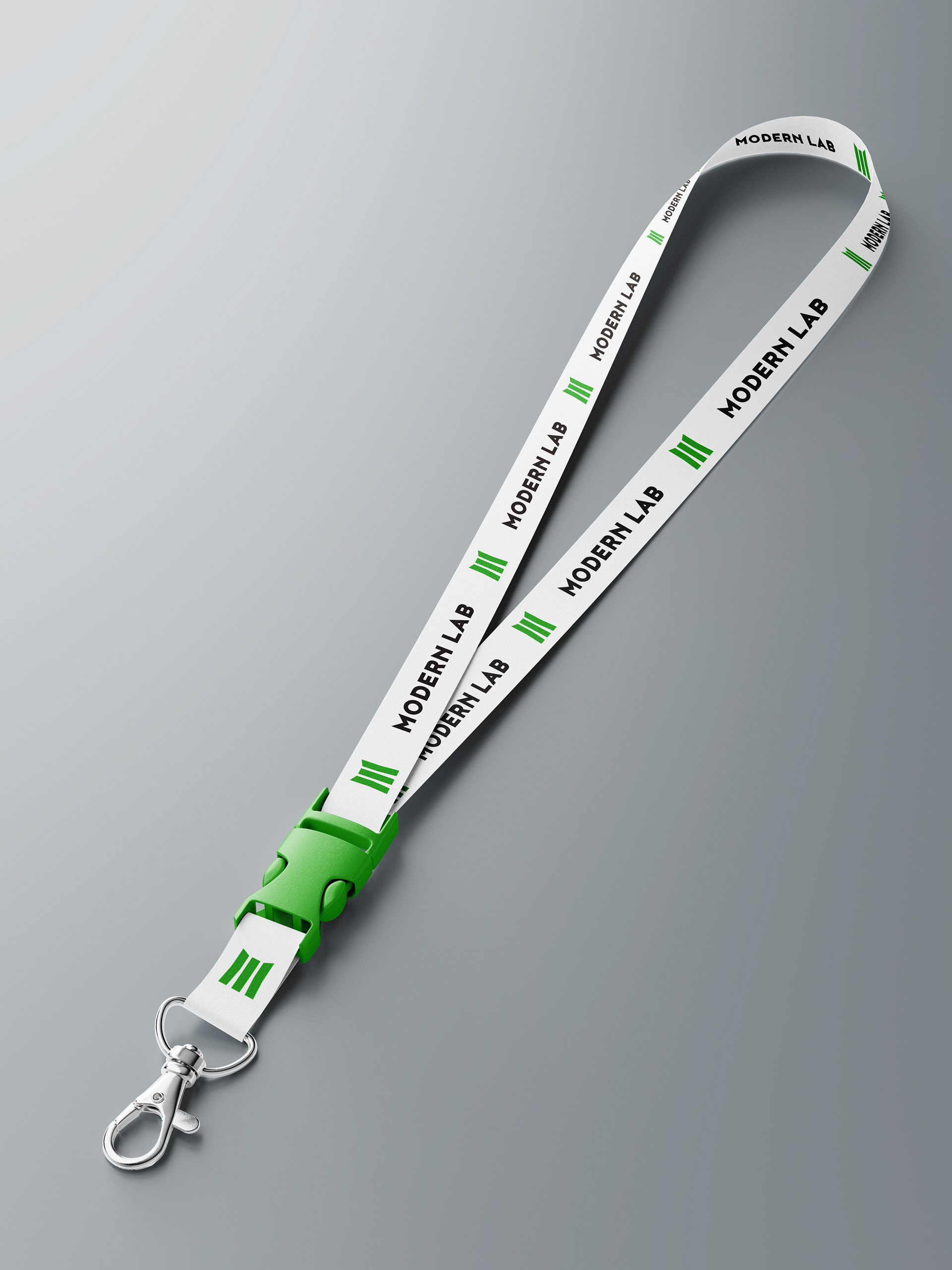
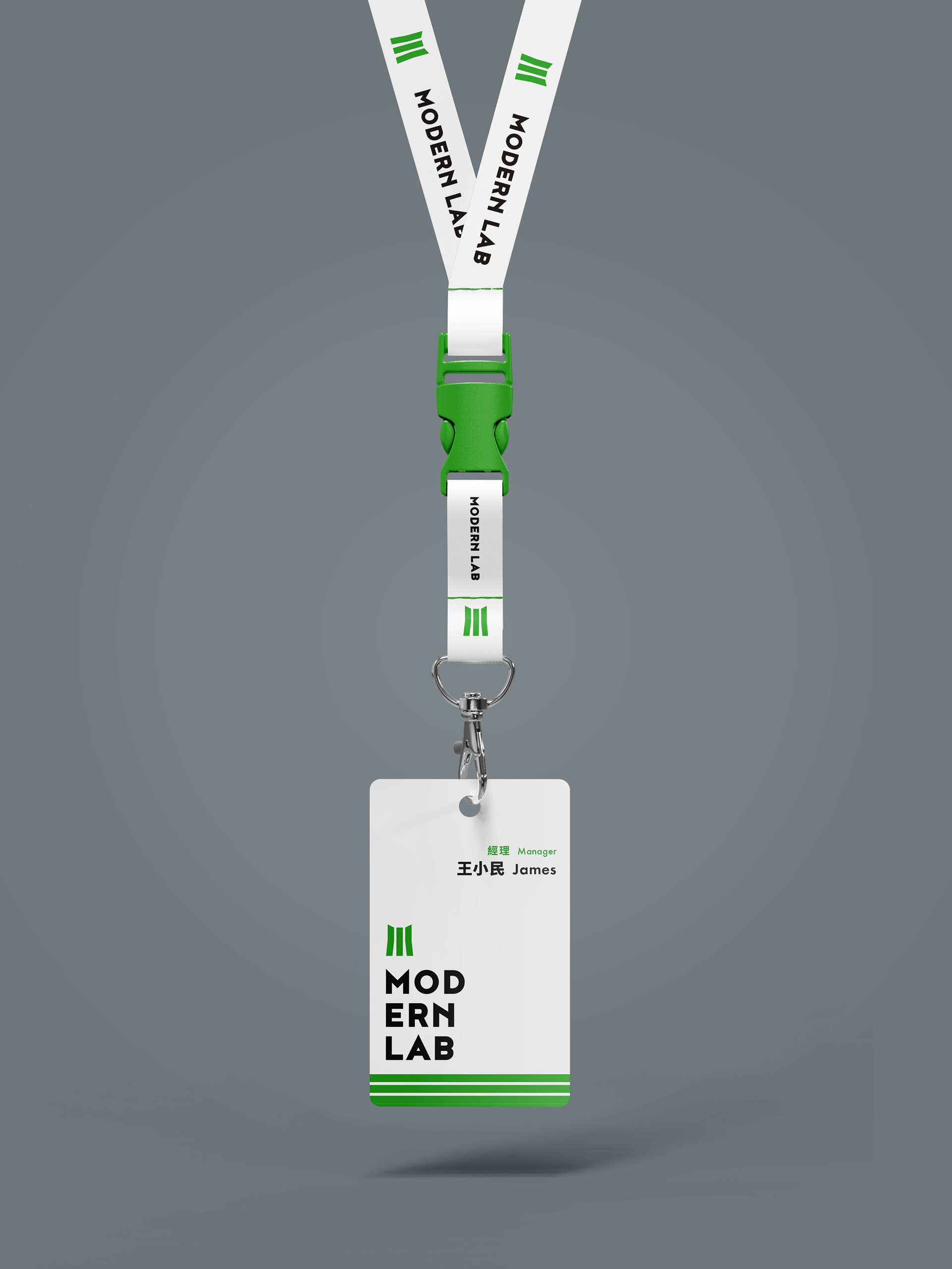
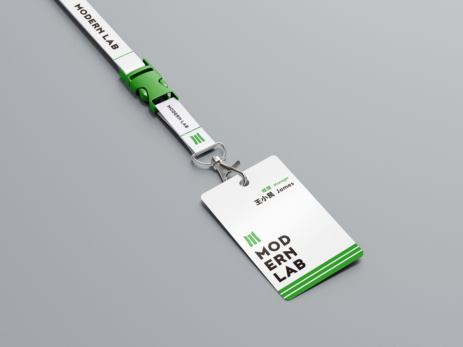
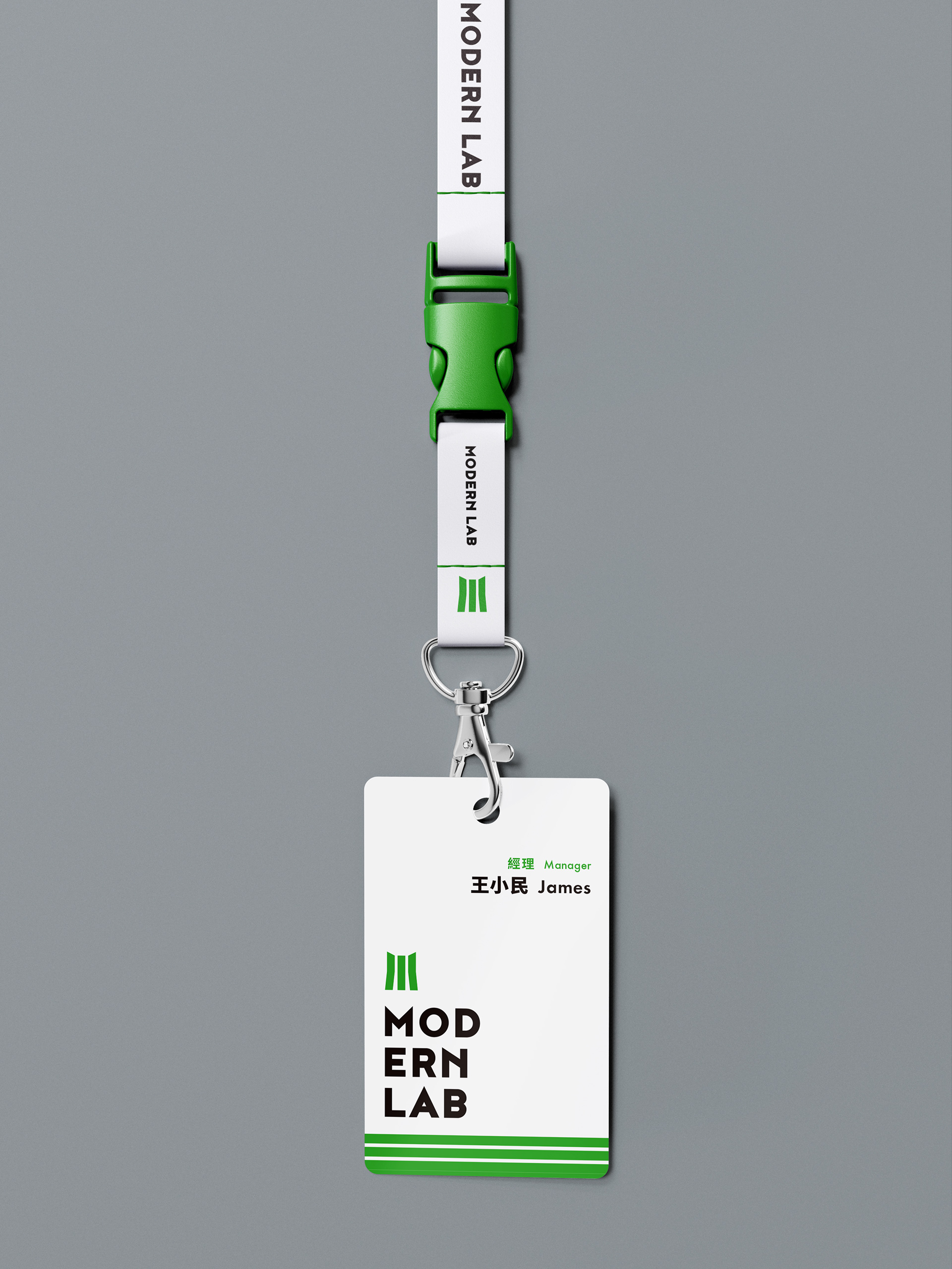
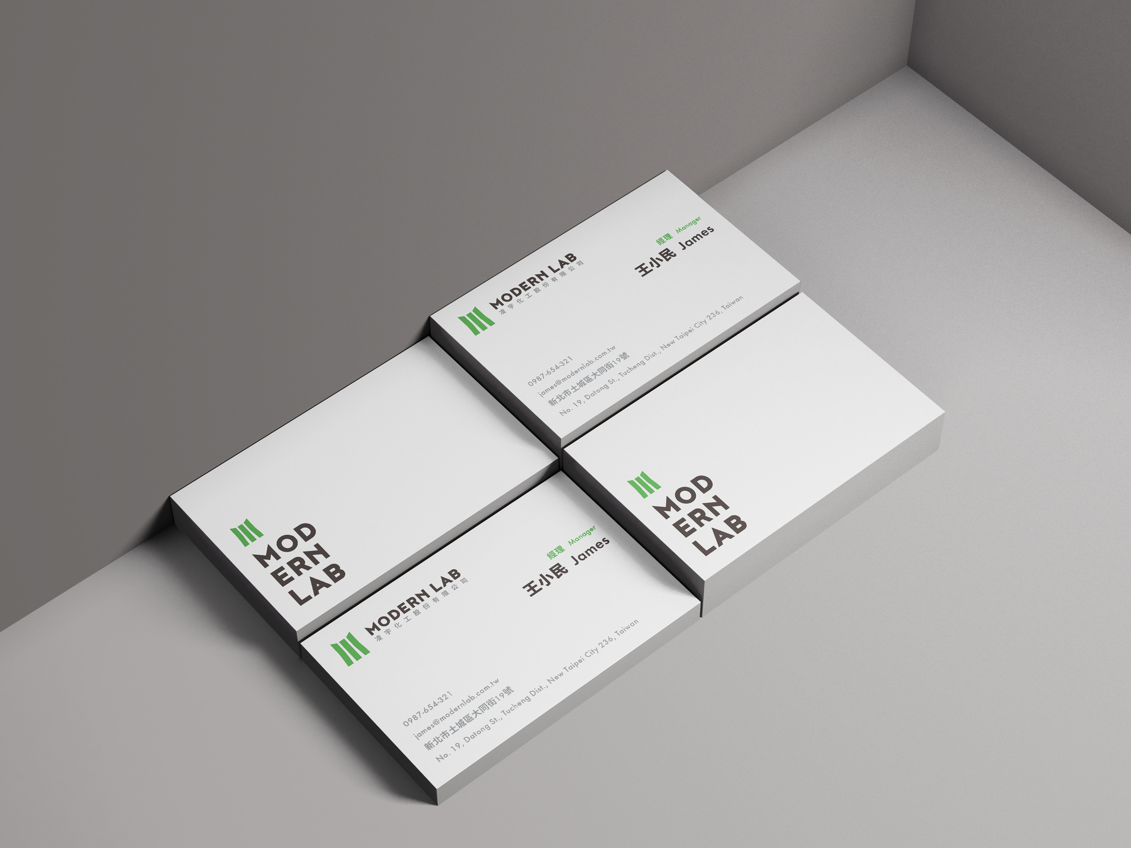
凌宇化工 - 視覺識別
MODERN LAB Inc. - Visual Identity
-----
Client | 凌宇化工股份有限公司 MODERN LAB Inc.
Design Agency | THE 90s LAB
Designer | Tan Yu-Chen