Pice Lab - 視覺識別 Visual Identity
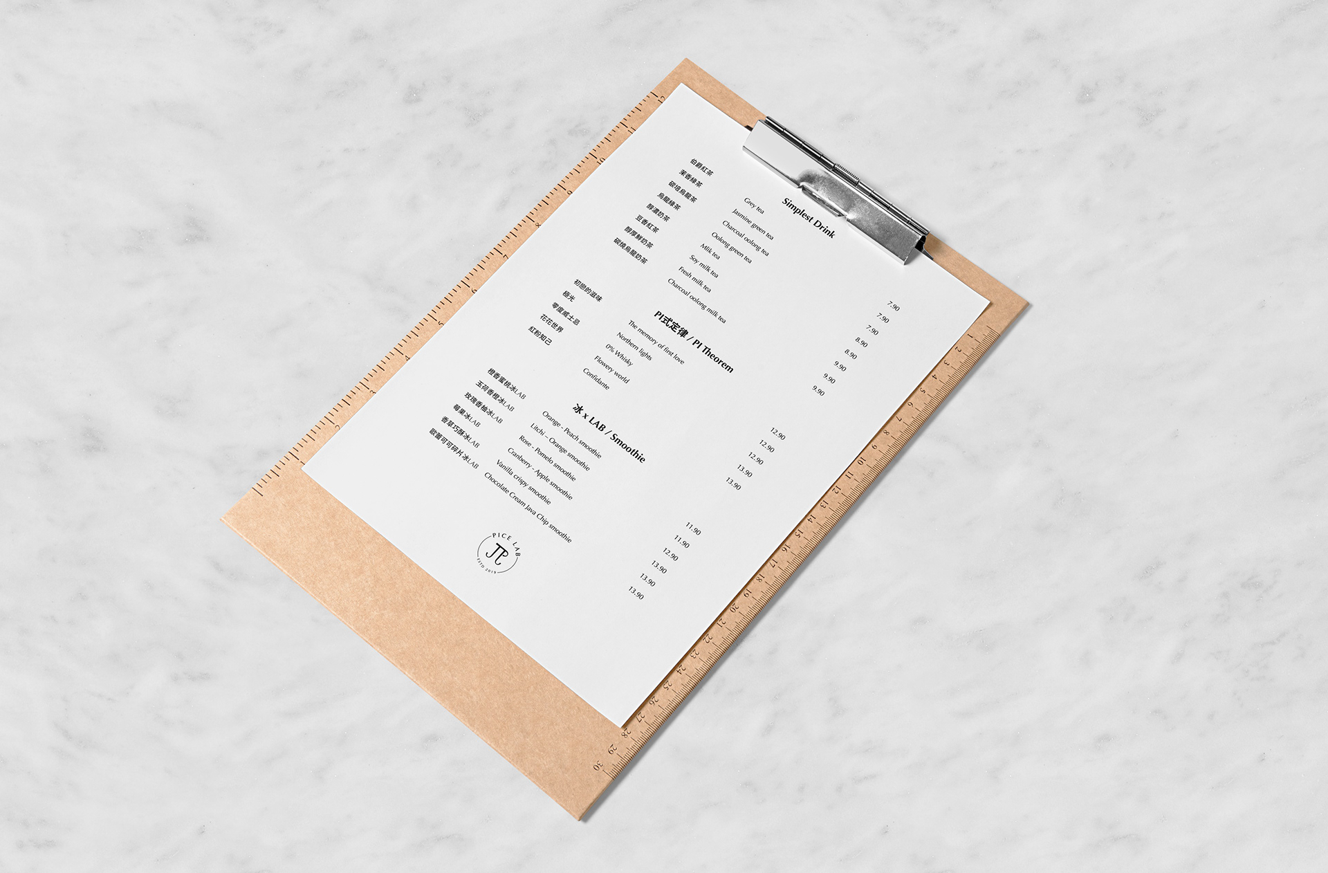
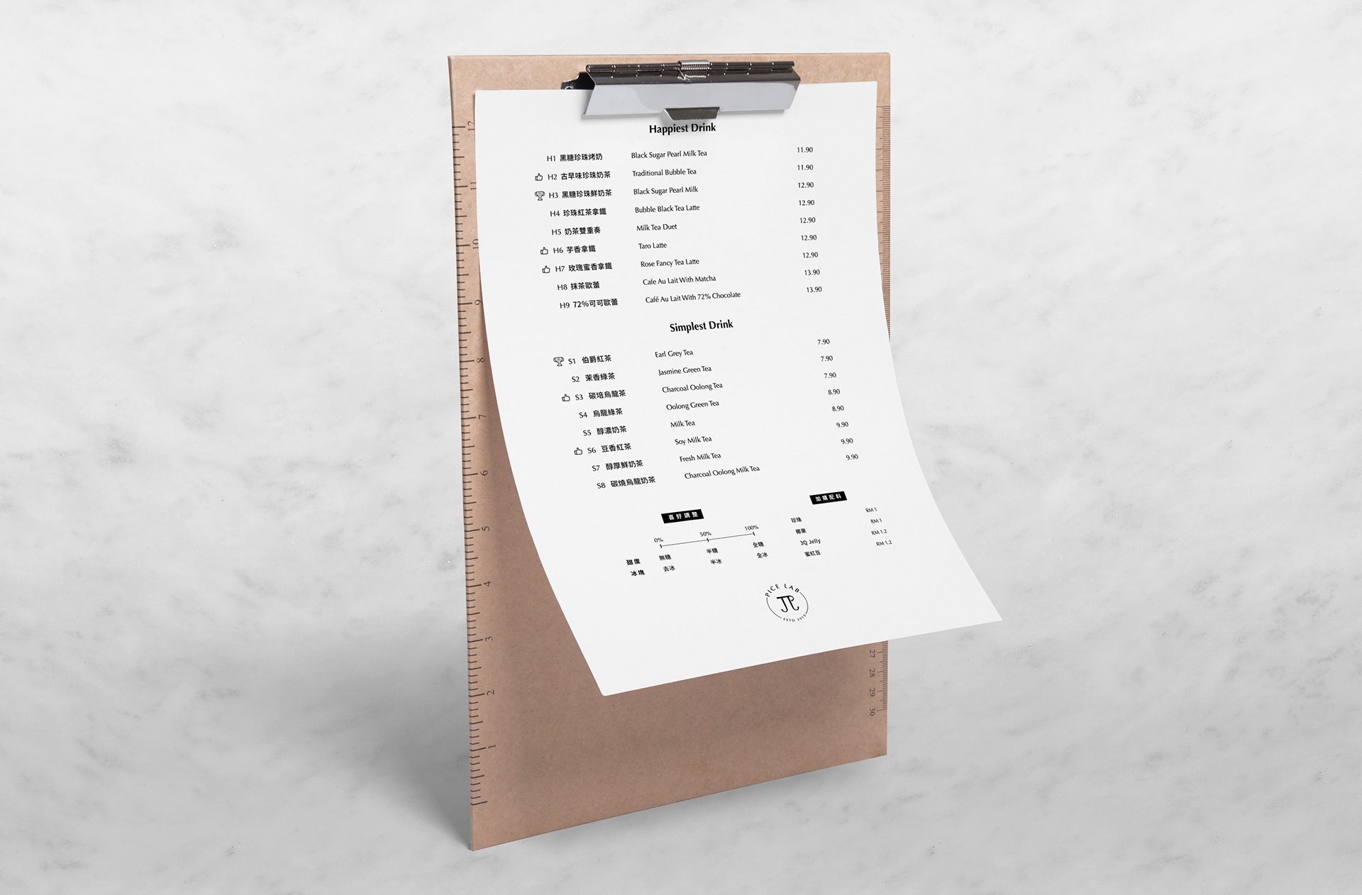
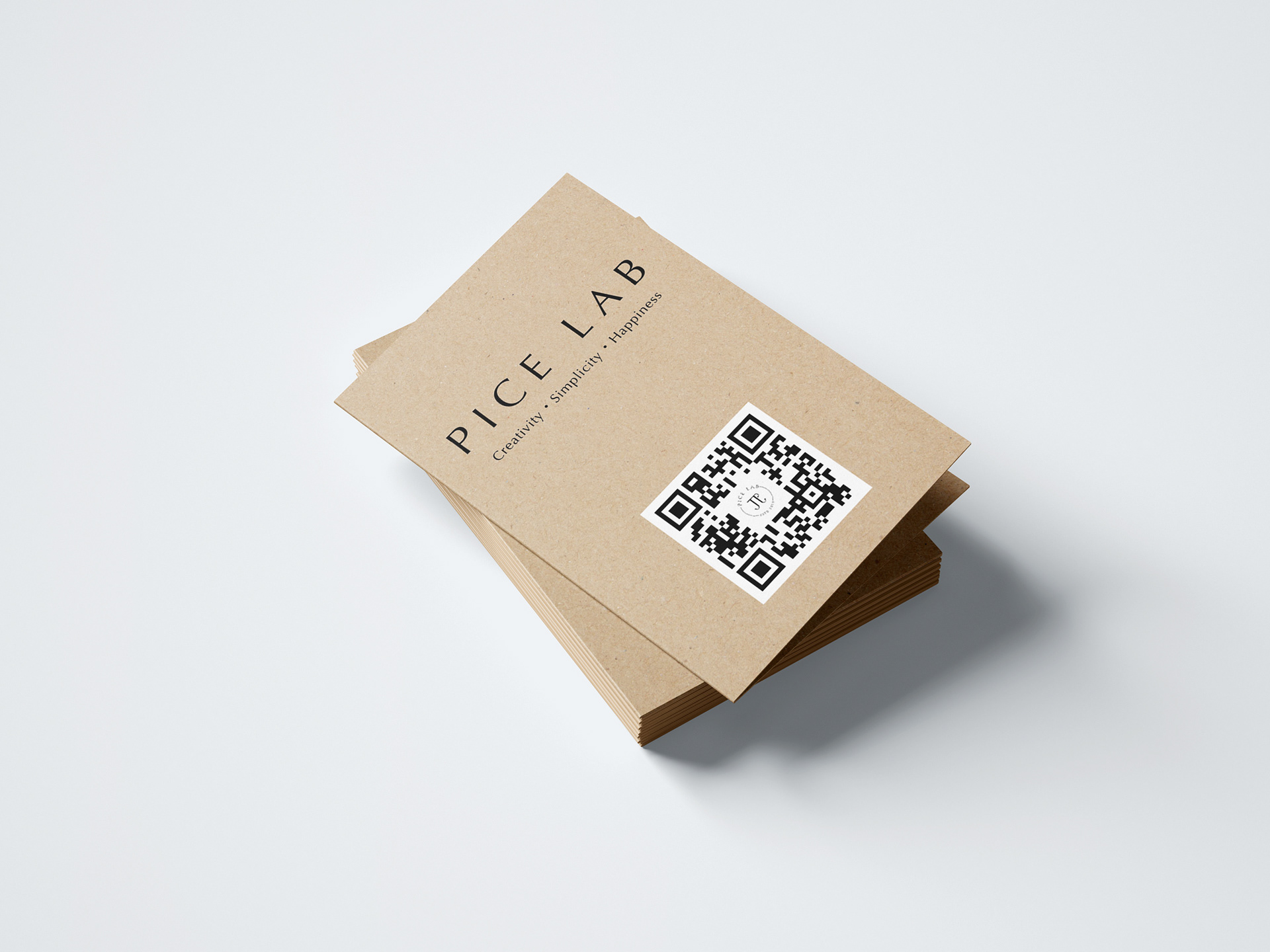
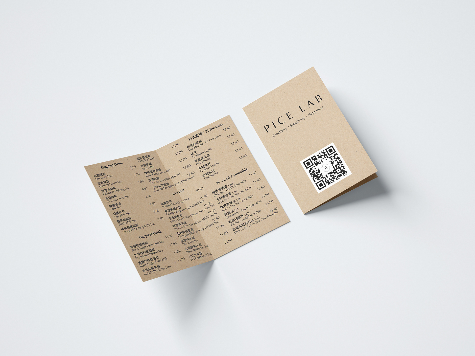
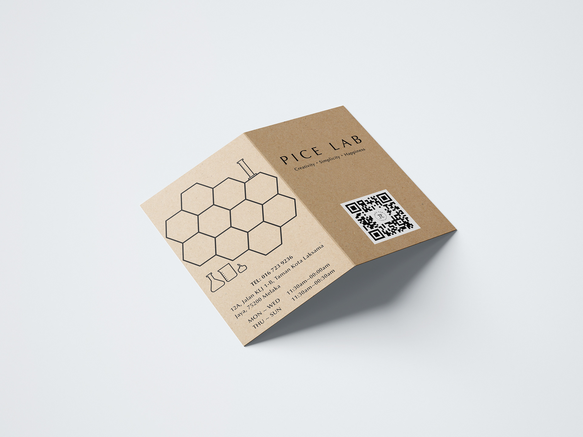
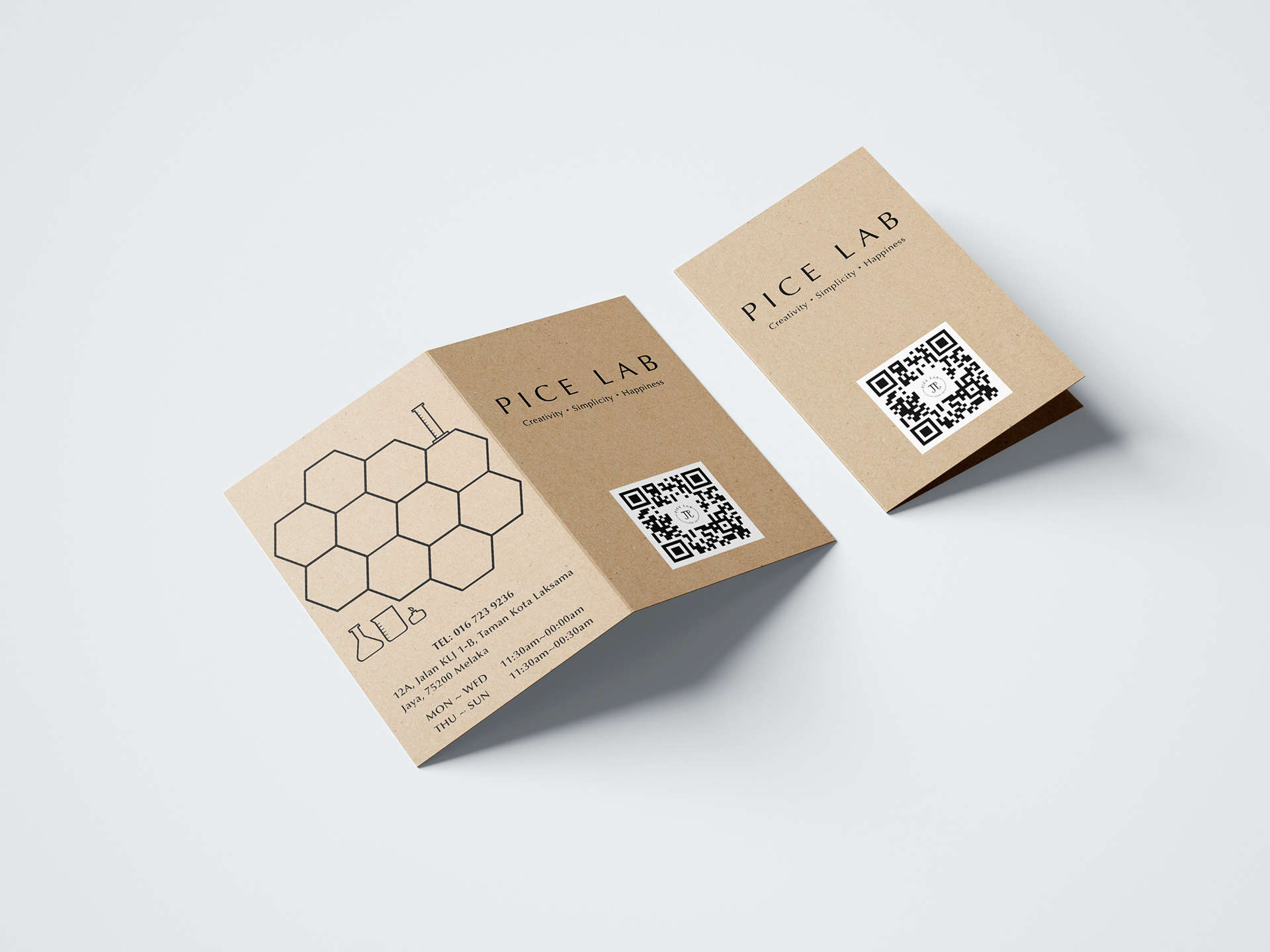
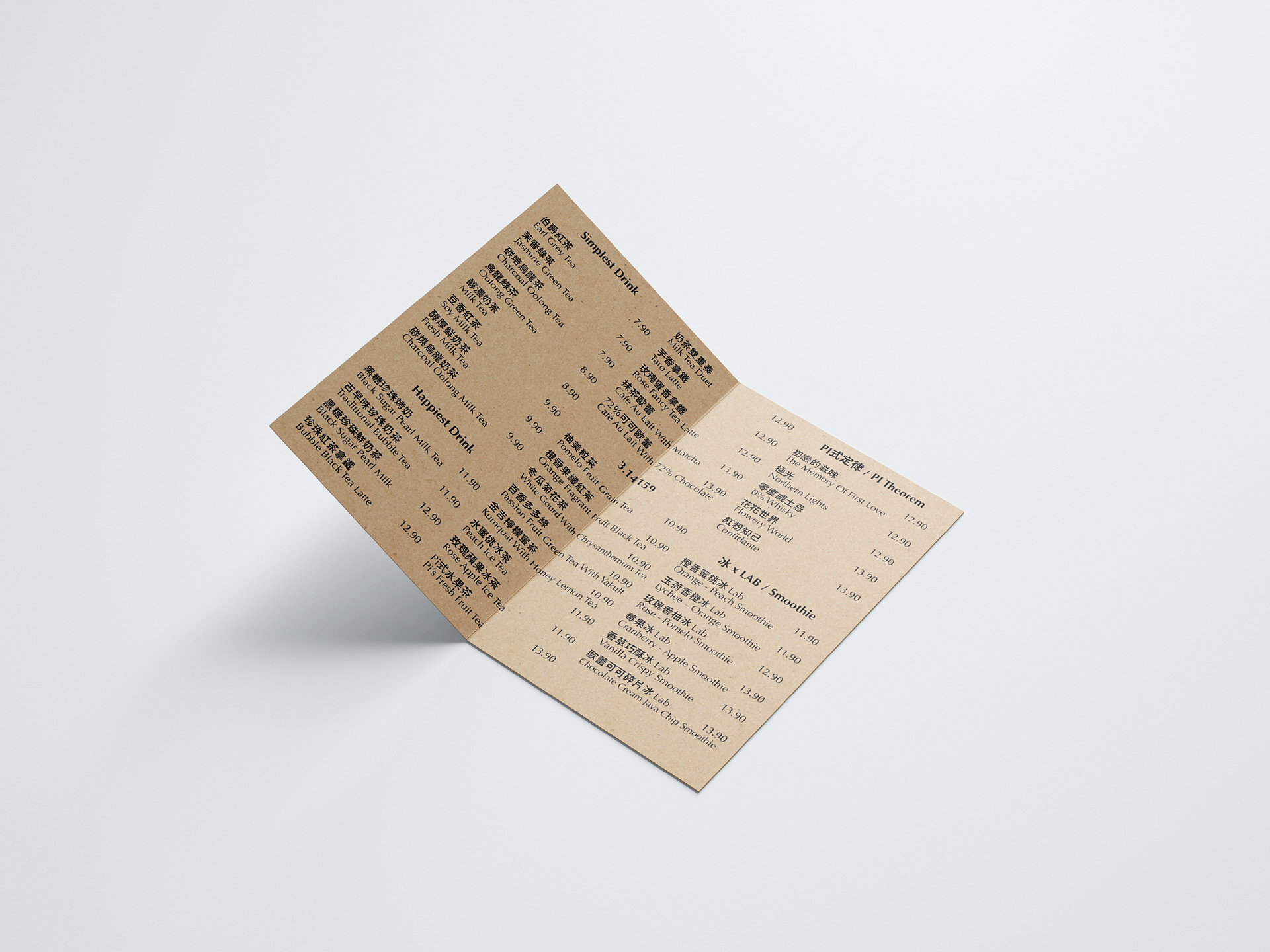
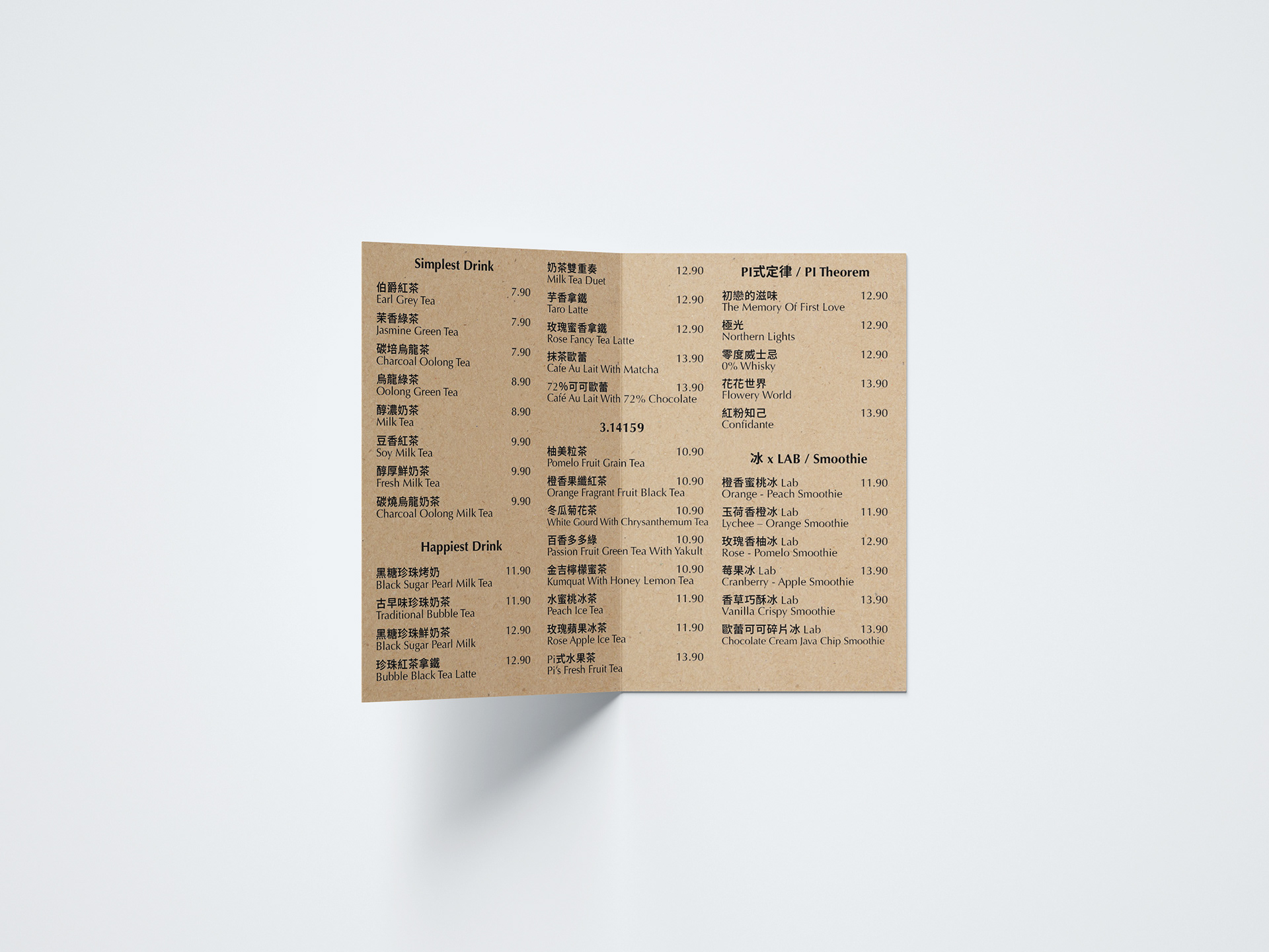
Pice Lab 是來自台灣的團隊,希望將台灣獨特的珍奶文化,帶到馬來西亞馬六甲,所創立的新飲料品牌。取名π (pi) 象徵著永無止境,秉持實驗精神,創造獨特風味飲品,打造幸福、簡約且富有創意的休閒空間。標誌符號用三個相同的勾排列組合出 π 的符號。外框的圓呼應勾勾在線條上有粗細調整, 也順時針旋轉15度,增添變化性。標準字上,選用 "Optima" 這款充滿人文氣息的無襯線字體, 延伸的筆尾與羅馬比例的結構, 給人現代之餘又兼具纖細、雅緻印象。顏色選用黑與白為基底, 搭配大地色系的淺咖啡色。材質運用木頭、文化磚、牛皮紙等元素,營造出符合簡約、優雅的品牌精神與整體視覺。
Pice Lab is a new beverage brand founded by a team from Taiwan, hoping to bring the unique bubble milk tea culture from Taiwan to Malacca, Malaysia.The name π (PI) symbolizes the endless. The team holds the spirit of experimental esthetics to create drinks with unique flavor, and to give a vibe of happy, simple, creative and leisure.The logo mark π is comprised of three same ticks. The circle of the outer frame echoes the thickness modification of the ticks. Ticks also rotate by 15°C clockwise to add some variation.Optima is a humanistic sans serif typeface for the logotype. The extended end of the character and the structure of Roman proportion give the impression of modern, slenderness and elegance.Black and white are selected as base colors to go with earth-toned light brown. Wood, cultural bricks and Kraft paper are used as materials to cohere with simple, elegant brand spirit and overall visual.
Pice Lab - 視覺識別 Visual Identity
-----
Client | Pice Lab
Design Agency | THE 90s LAB
Designer | Tan Yu-Chen